Thomas Schneider
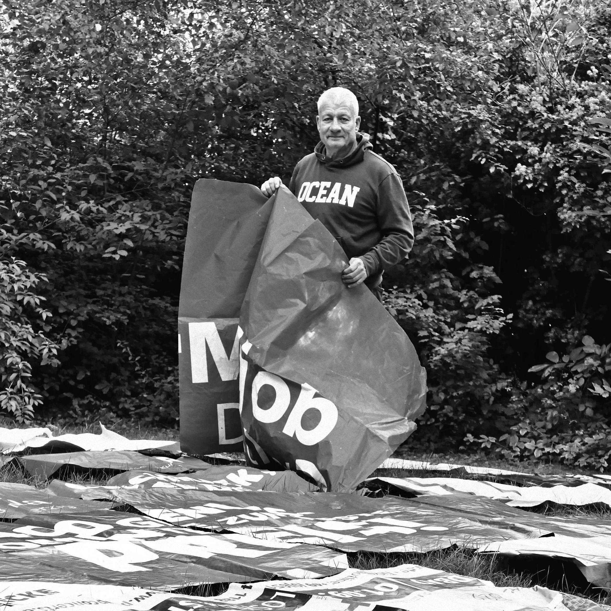
Thomas Schneider uses the typography from found posters and cardboard boxes to create abstract compositions that are minimal, beautiful and intriguing. We loved his work the minute we saw it. So, we got in touch to get the inside story of Thomas's creative and unique approach to collage.
First published in 2022
Hi Thomas, Can you give us a bit of background on your route into collage?
As a teenager I attended painting and drawing courses at a free academy. After that I studied graphic design and worked as an art director in advertising agencies for 10 years. I then started my own business and later spent a lot of time with my son. Always doing a lot. During the holidays I started making collage postcards for my friends and relatives, and always only from the material that I could find locally without buying anything.
It was like this for many years. In the end there were so many postcards that I wanted to make that I wasn’t really on vacation anymore, but I could always tell where and in which corner a waste paper container was. At some point these collages became decollages and I made the decollages bigger and with glue on canvas for several years.
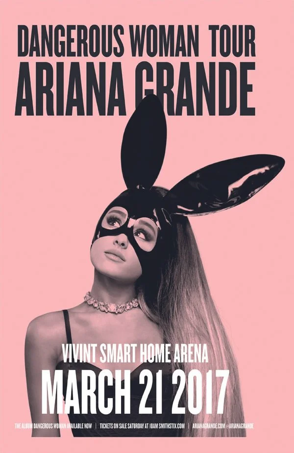
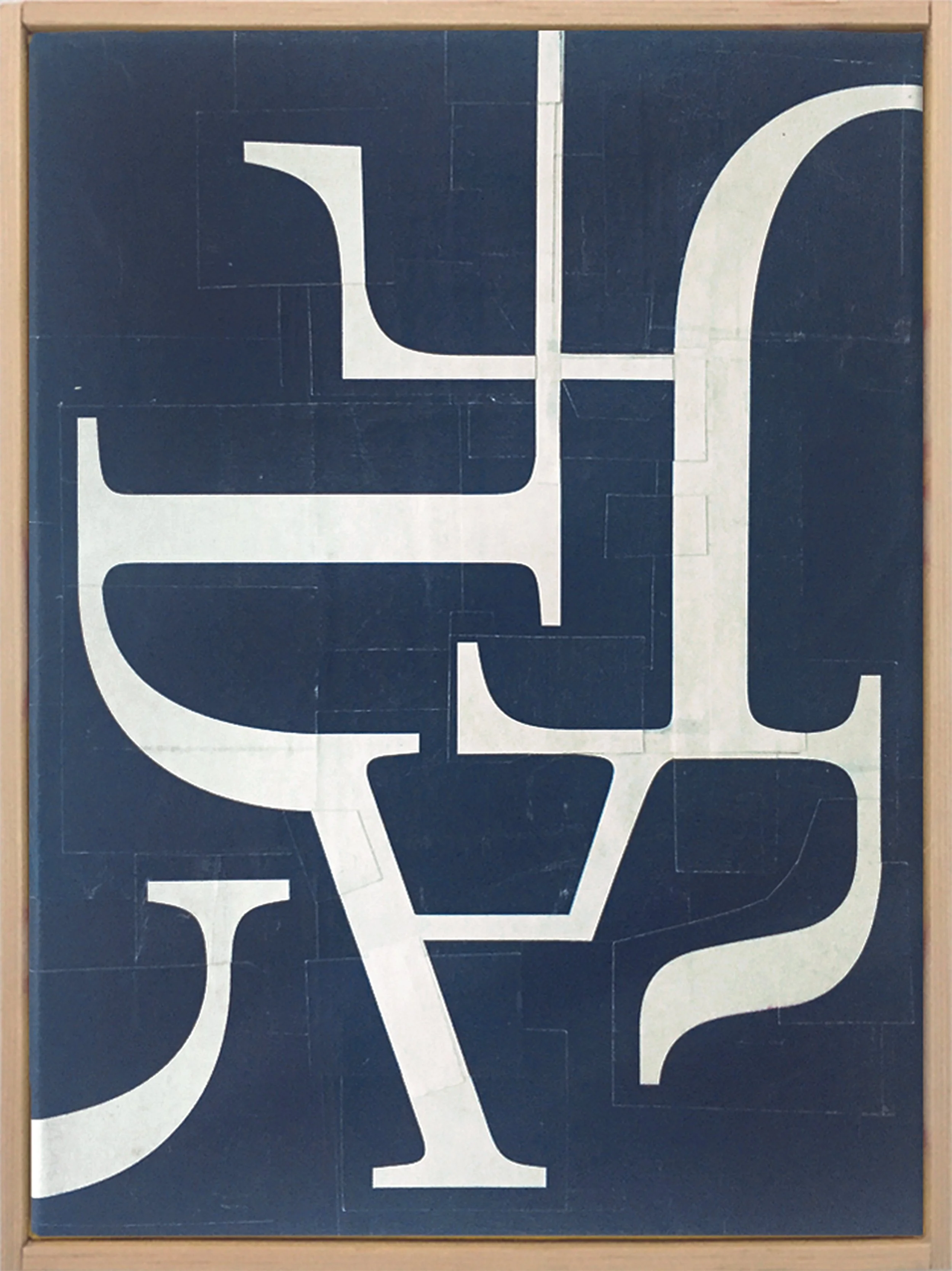
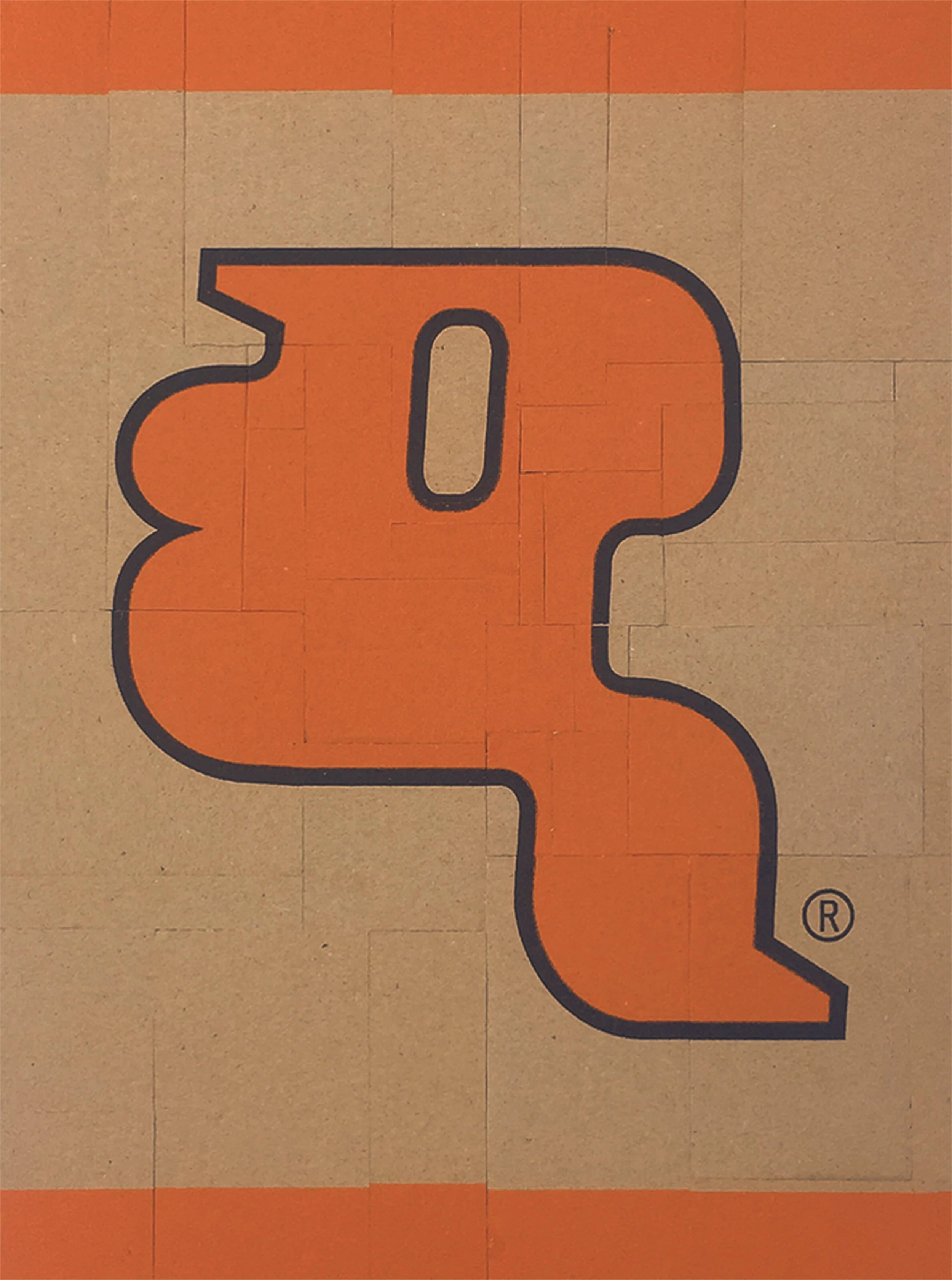
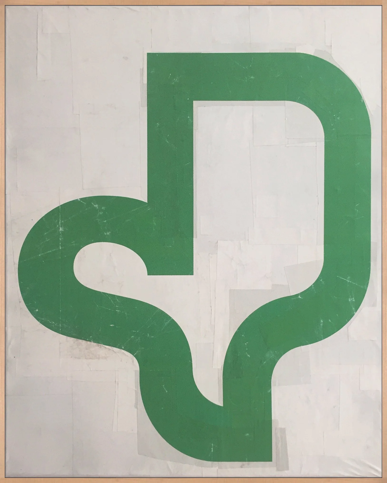
One day I got my hands on a piece of typography that I thought would be impossible to tear up. A poster of Ariana Grande. This is how this first work of typography-collages came about.
Does your collage work feed into your graphic design at all?
No. I earn my money with graphic design for different clients, it has nothing to do with my collages. At most, on the one hand, I visualise messages and in my free work I first destroy messages and then put them back together again. Sort of like Dr. Jekyll and Mr. Hyde
Typography plays a big part in your work, can you tell us a bit more about that?
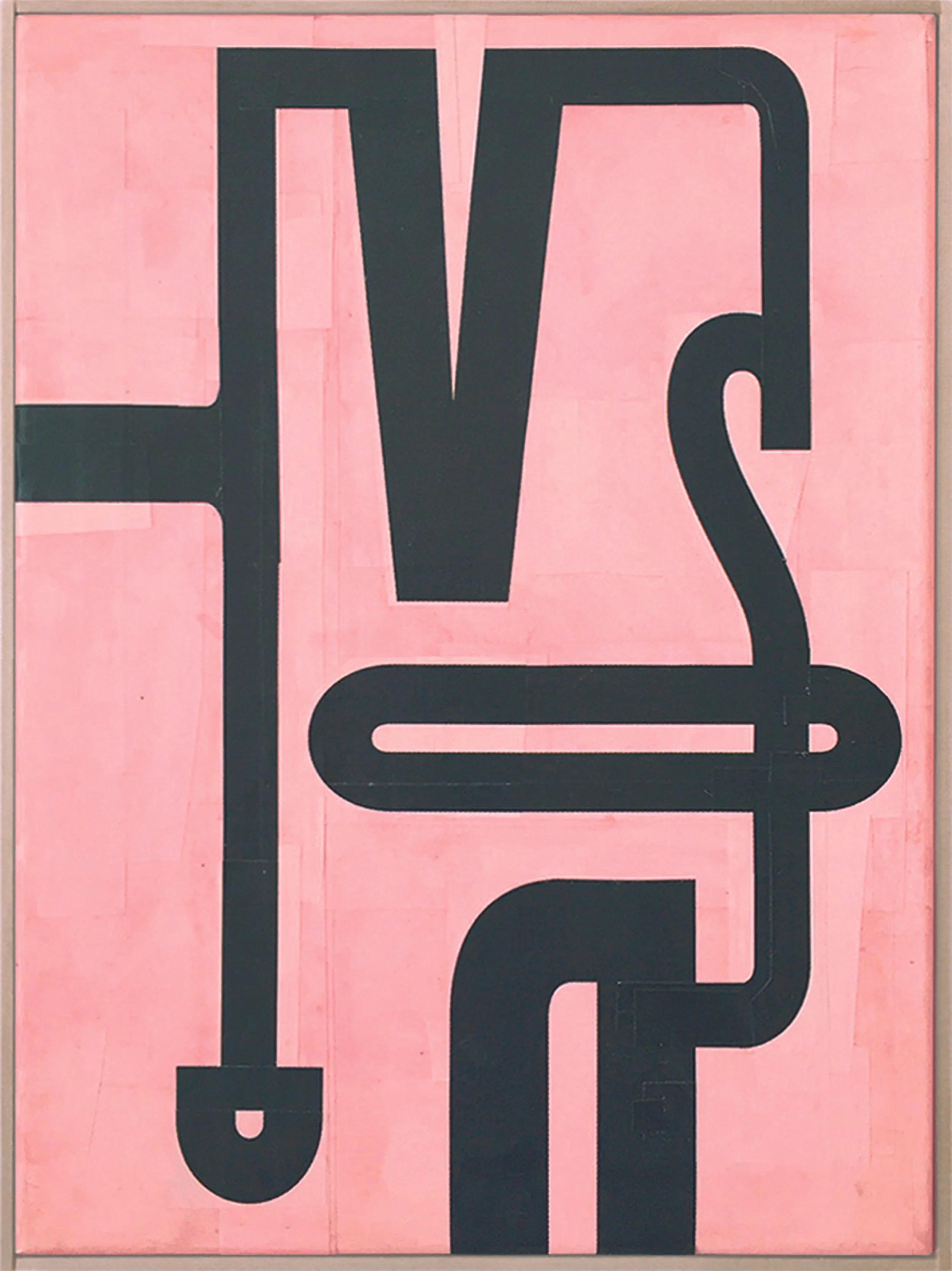
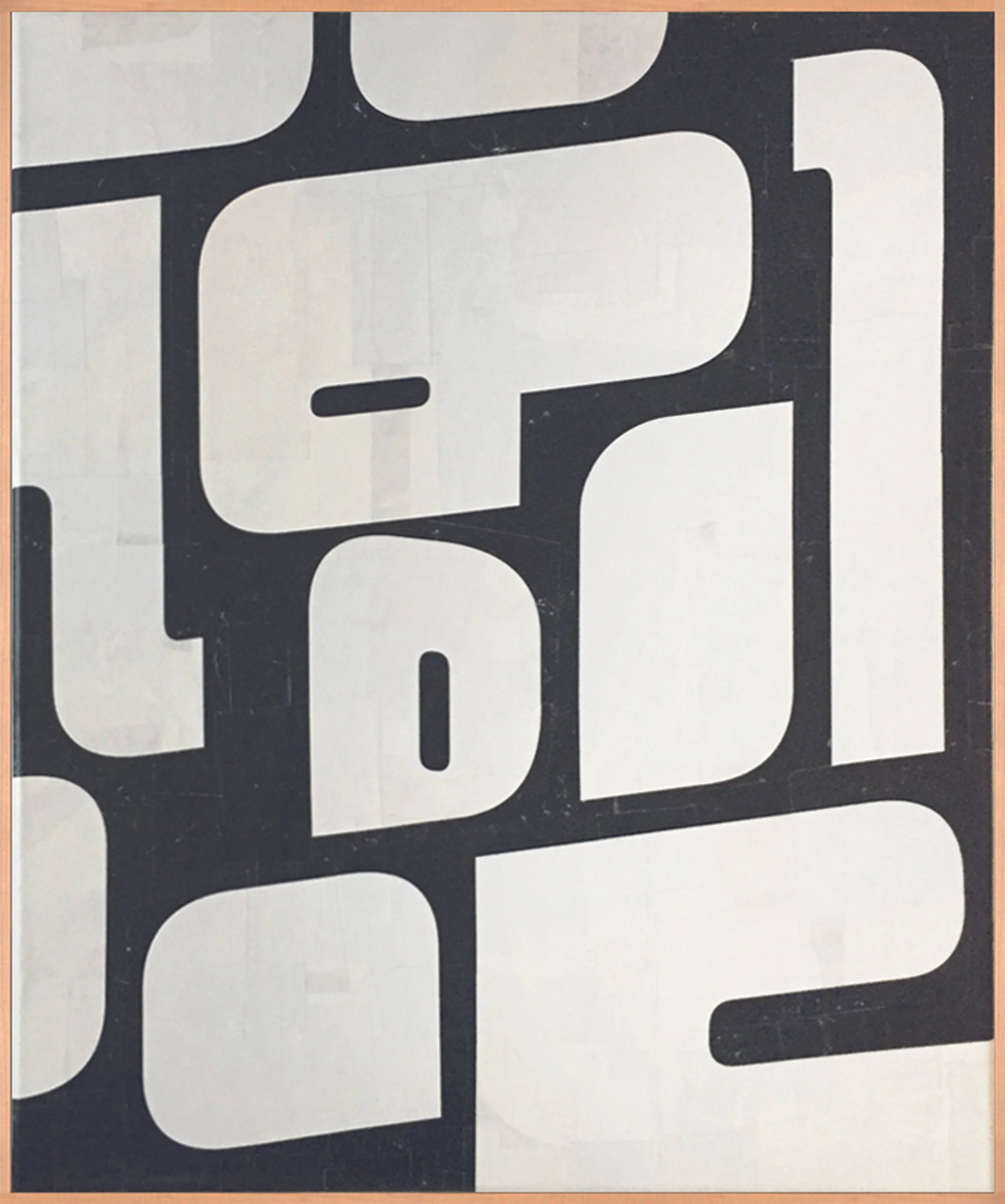
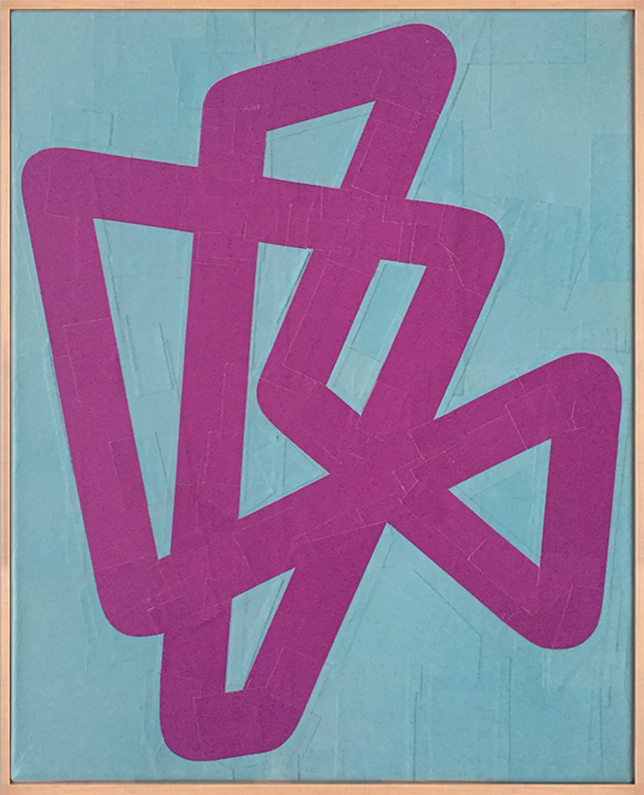
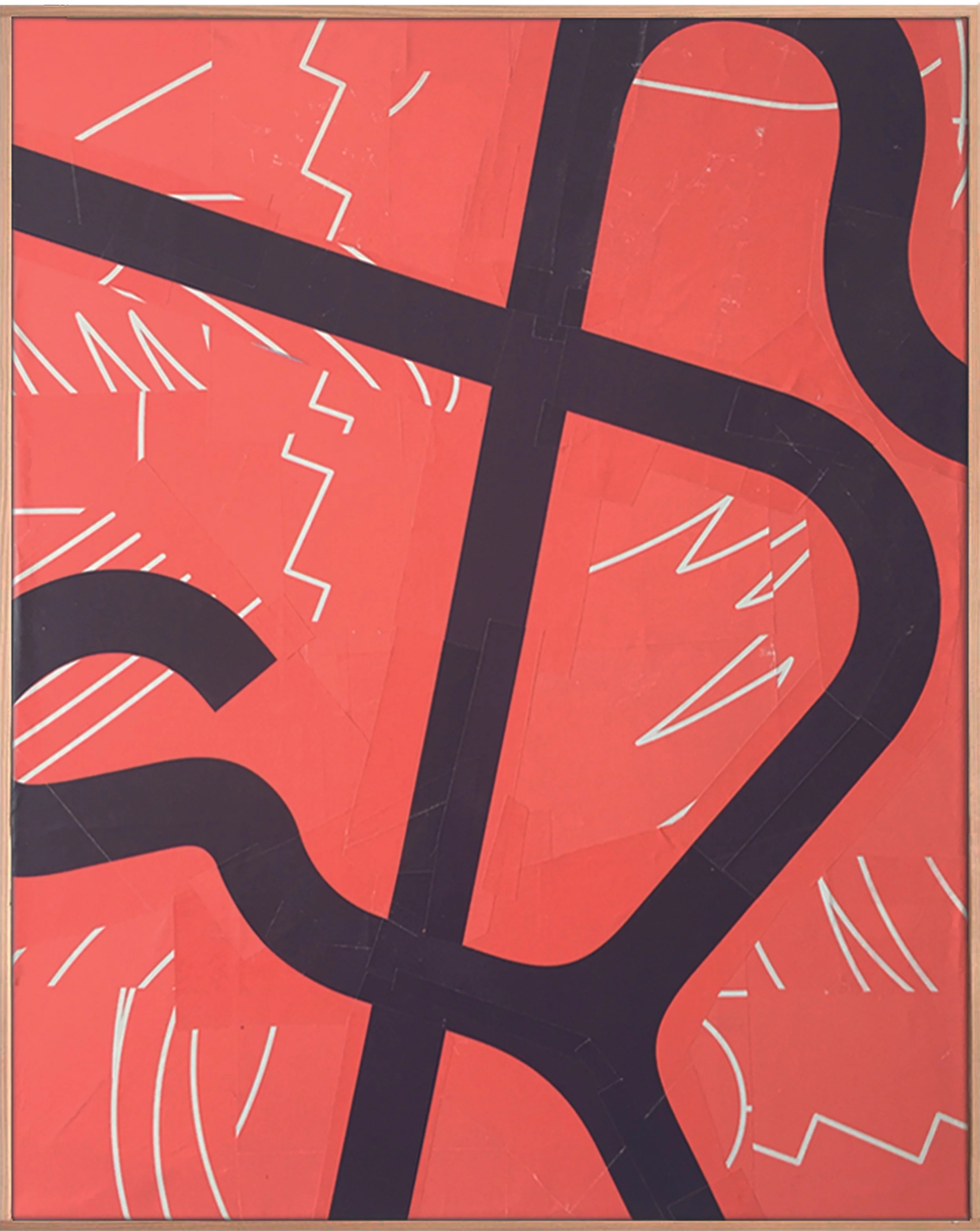
I find it exciting, because letters are made of signs and from these, I make a sign again, my own kind of script, a separate typeface which cannot be read, maybe just like us humans when we first saw hieroglyphs and could not decipher them.
Typography consists of letters and these letters form a code that contains a specific message. I resolve this message by cutting the letters apart and recombining them. When I start
I don‘t know what shape will be at the end. However, the shape of the letters (condensed, bold...) always gives a kind of direction and influences the end result. In some cases there is a relationship between the final form and the content of the typography.
There’s a simplicity and purity to your use of colour and composition which, given your source materials, could have been very different. Is this a driver in your work – a desire for simplicity?
No, it is not a motivation for my work. The reason for the simplicity is more that the basic material consists of typography from posters. Posters are designed very loudly and simply, they have to be noticeable quickly. This language of form seems familiar to the viewer, although they cannot decipher the message. Unfamiliar, so to speak.
It’s clear that your source materials are integral to your creative process, I read on your website that you once cycled an entire island in search of identical cardboard trays – that suggests you’re planning your work as you’re collecting the materials…
Yes, the starting material always plays a very important role. In that case, it wasn‘t a collage but a mosaic (that’s what I call these works because they are glued together and not on top of each other like in a collage). I found a banana box and I knew one box was not enough. For this reason I was looking for more banana boxes in several supermarkets on the island.
I don’t plan, but the starting material always dictates the form that emerges from it and, above all, the limited material also plays a role (I only have 1 to 3 posters that I can use) – this also differs from my daily work on the computer, where you can duplicate endlessly. I also like the glue on my fingers.
Is there any messaging in your work that you’re trying to convey to the audience?
No, I have no direct message. If there was one, then it would be the connection from simple everyday mass media, which usually ends up in the waste-paper basket, to creating an artistic unicum through the artistic aspect.
The fact that trying to decipher the collages can be as overwhelming as finding one’s way in the abundance of the consumer world – precisely the world that produced the collage material. So with this kind of 'criticism of consumer society' there is a similarity to Pop Art in terms of content.
How much of your work is about de-construction? You’re taking recognisable type and making it abstract.
Everything first revolves around deconstruction, but out of the deconstruction comes a new construction. I can‘t do that, I always have to end up with some sort of harmonious form that has its own tensions within itself. Where every snippet is in the right place. A friend looked at my collages and said: 'Thomas, I can see in your work that you are always looking for harmony.'
You can see more of Thomas’ work on his Instagram page : @thomasschneiderart and in Issue #1 (only available as Digital PDF) of Contemporary Collage Magazine