
Vintage Magazine Challenge
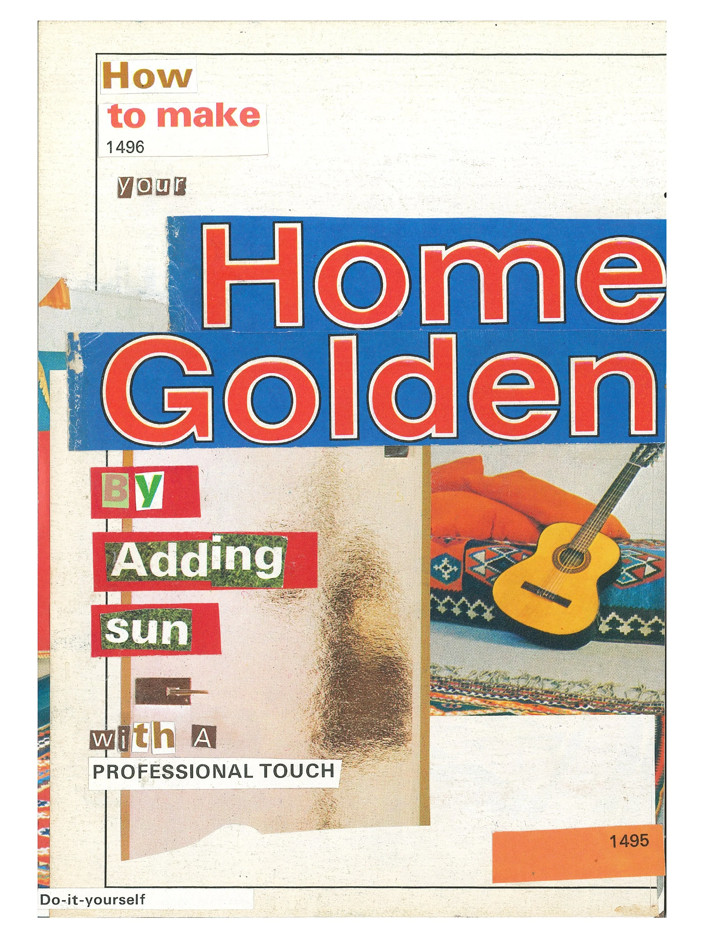
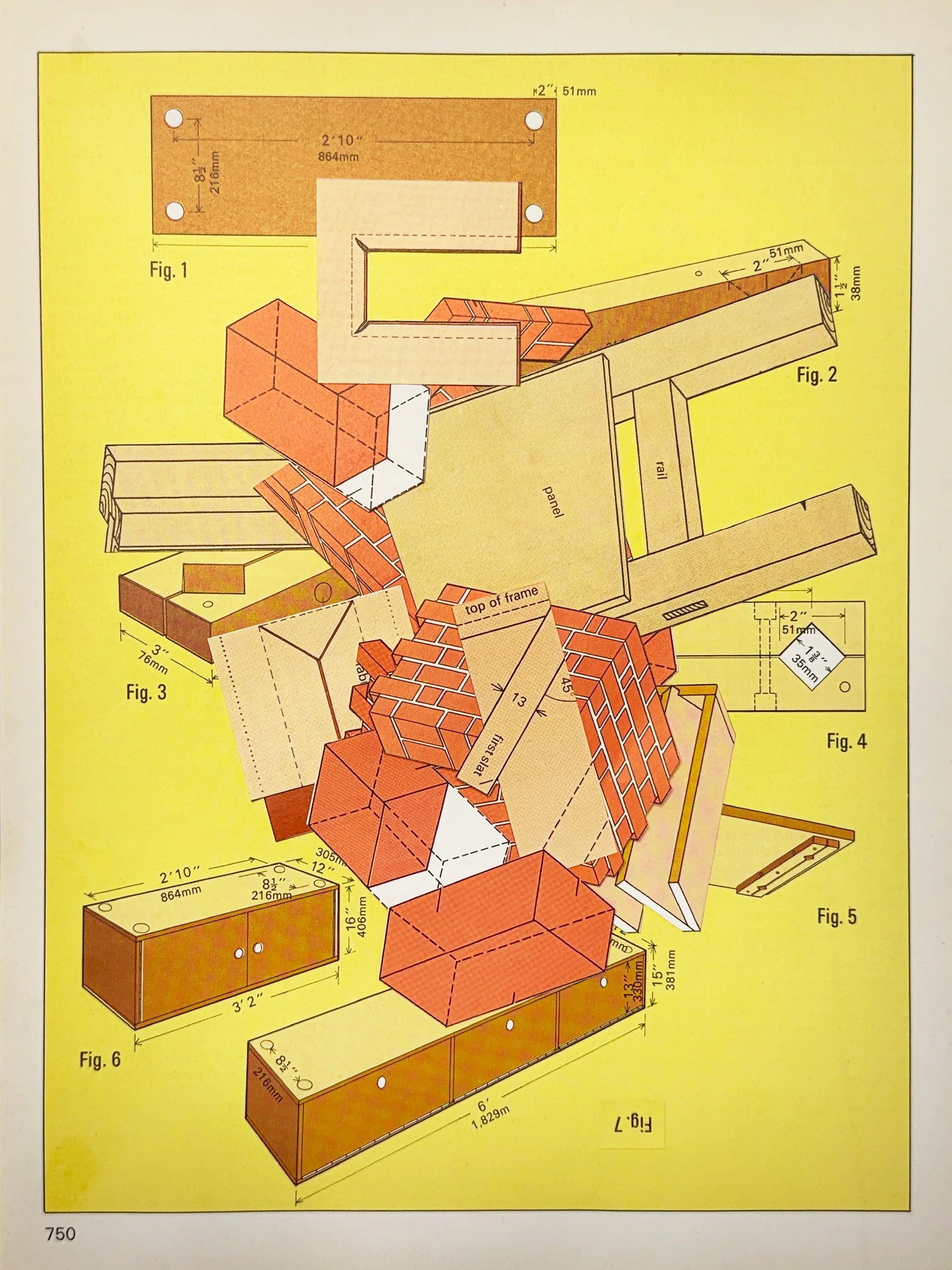
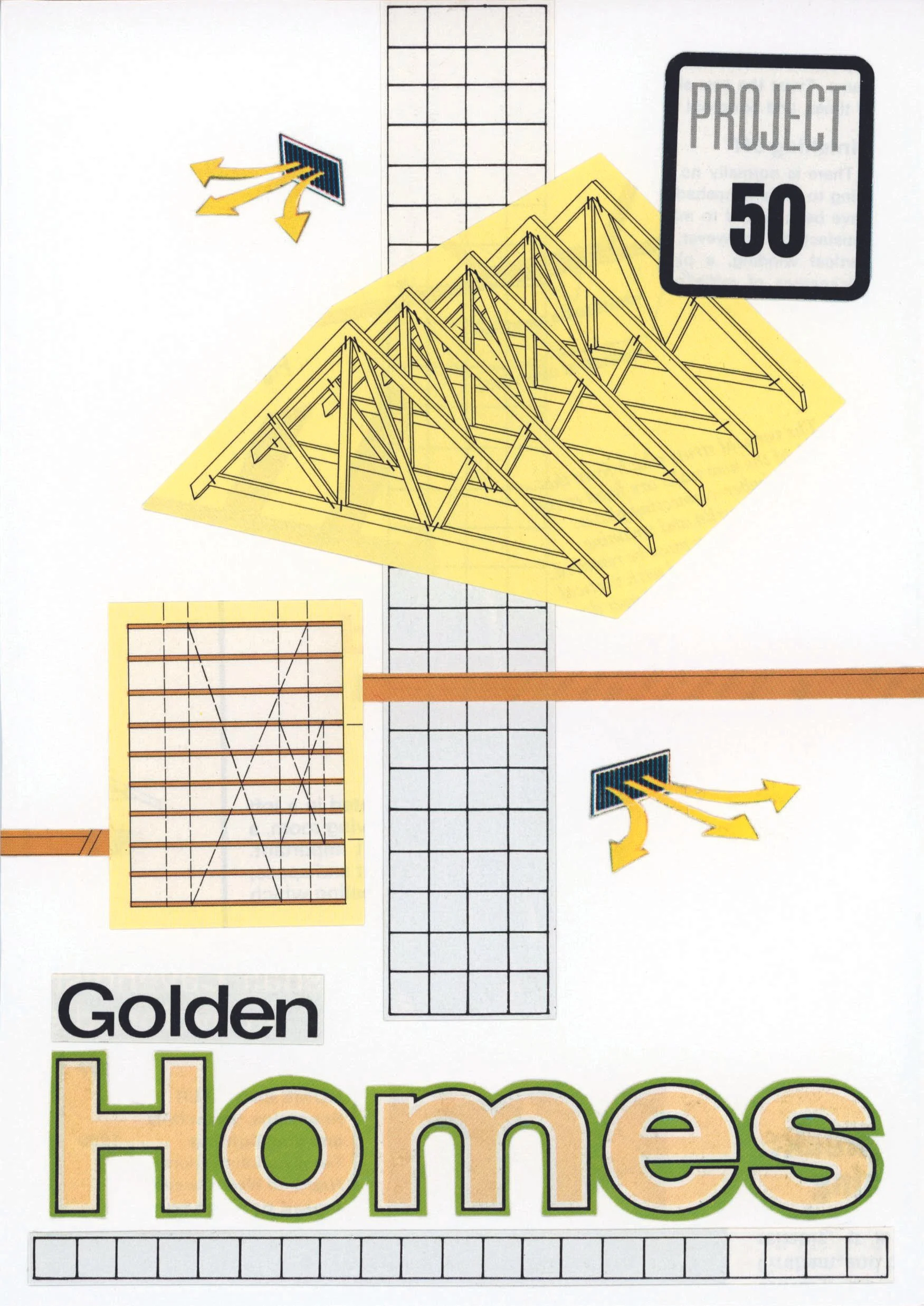
Our latest round of the ‘Vintage Magazine Challenge’ were all completed using two copies of Marshall Cavendish’s “Golden Homes” Magazine. This was a small publication released in the 1970’s featuring vibrant flat colours, photographs of interiors, wallpapers, diagrams, floor plans and instructional imagery.
The artists who took part with this magazine found it quite a challenge as much of the imagery is more practical that artistic, there was a lack of human figure in this publication. However many pushed through this initial creative block and went on to create some fantastic collages!


Collages by Julie Richards • @jrichards3500
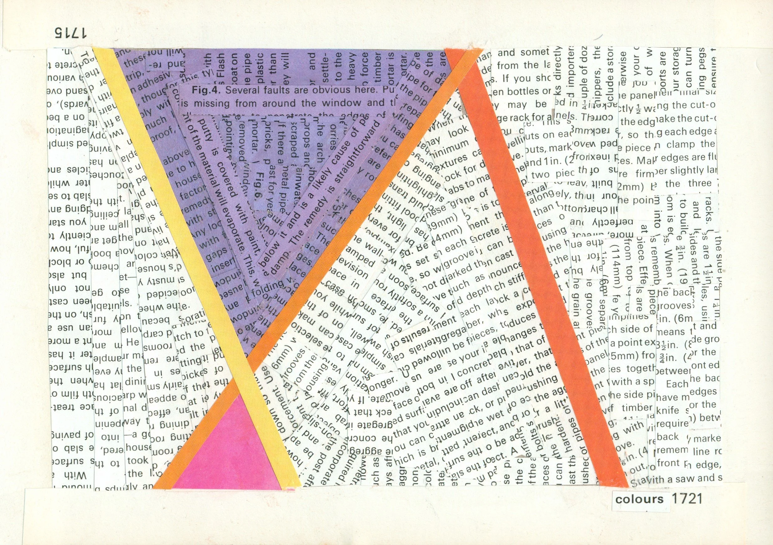
“Working with limited images is always challenging. These magazine articles had immense value in construction, but in an artistic sense, they lacked life and movement. I focused on bringing out colour and integrating the text as part of the design. I choose to reference back to the intent of the magazine, even in my abstracts, by keeping everything linear and precise.”

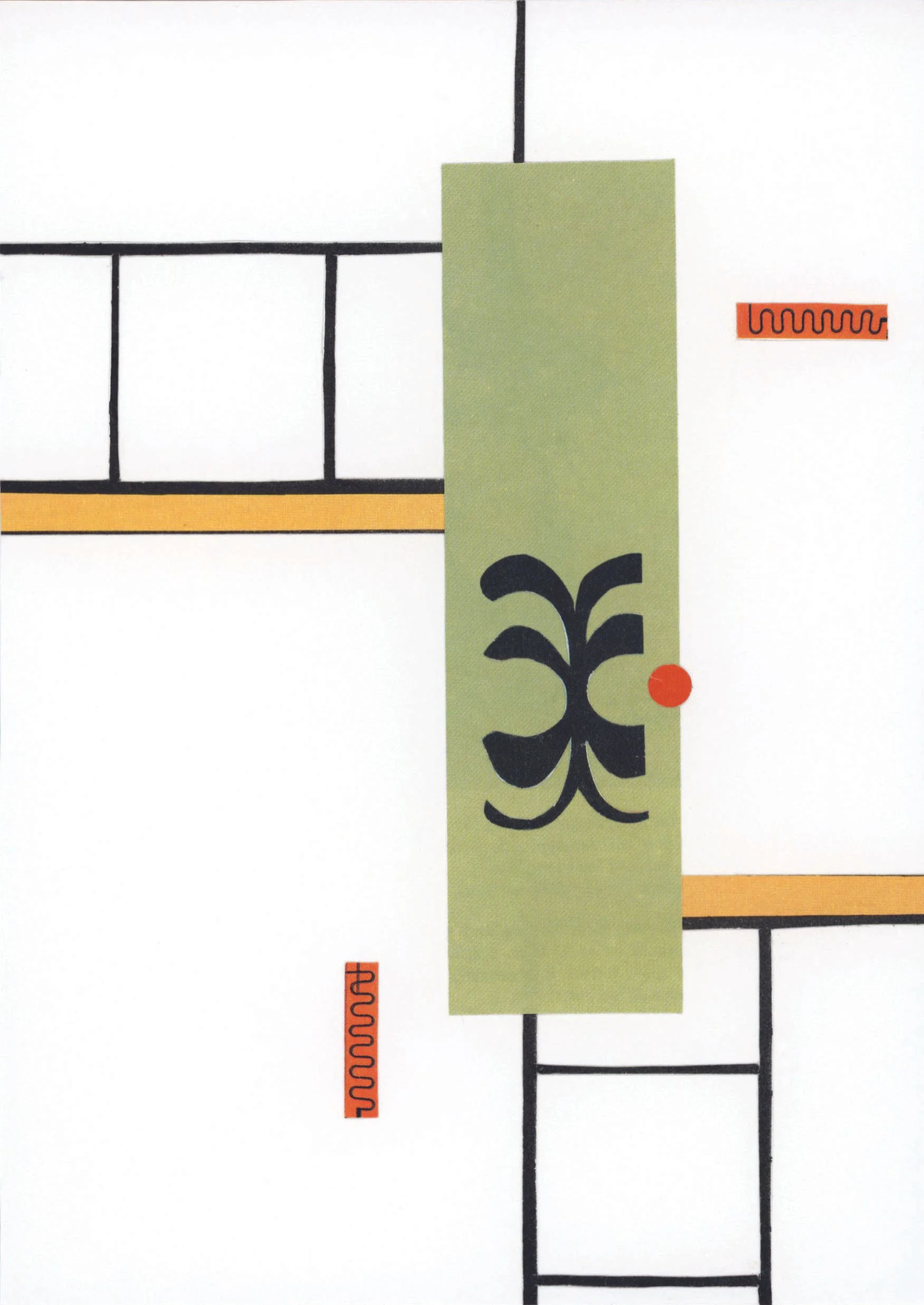
Collages by Martin Wilson • @rmwcollageart
“My approach to my collages varies. I have many folders of images I pore through, and depending on the day, some images will call out and demand to be used in a piece. For this challenge, my approach was different in that I was more limited in image selection. I work by instinct and I try not to overthink things. Mainly, I want to create something pleasant to look at, or at least something enigmatic or evocative, something one looks at and maybe utters, "Hmm. I like that, but I don't know why."
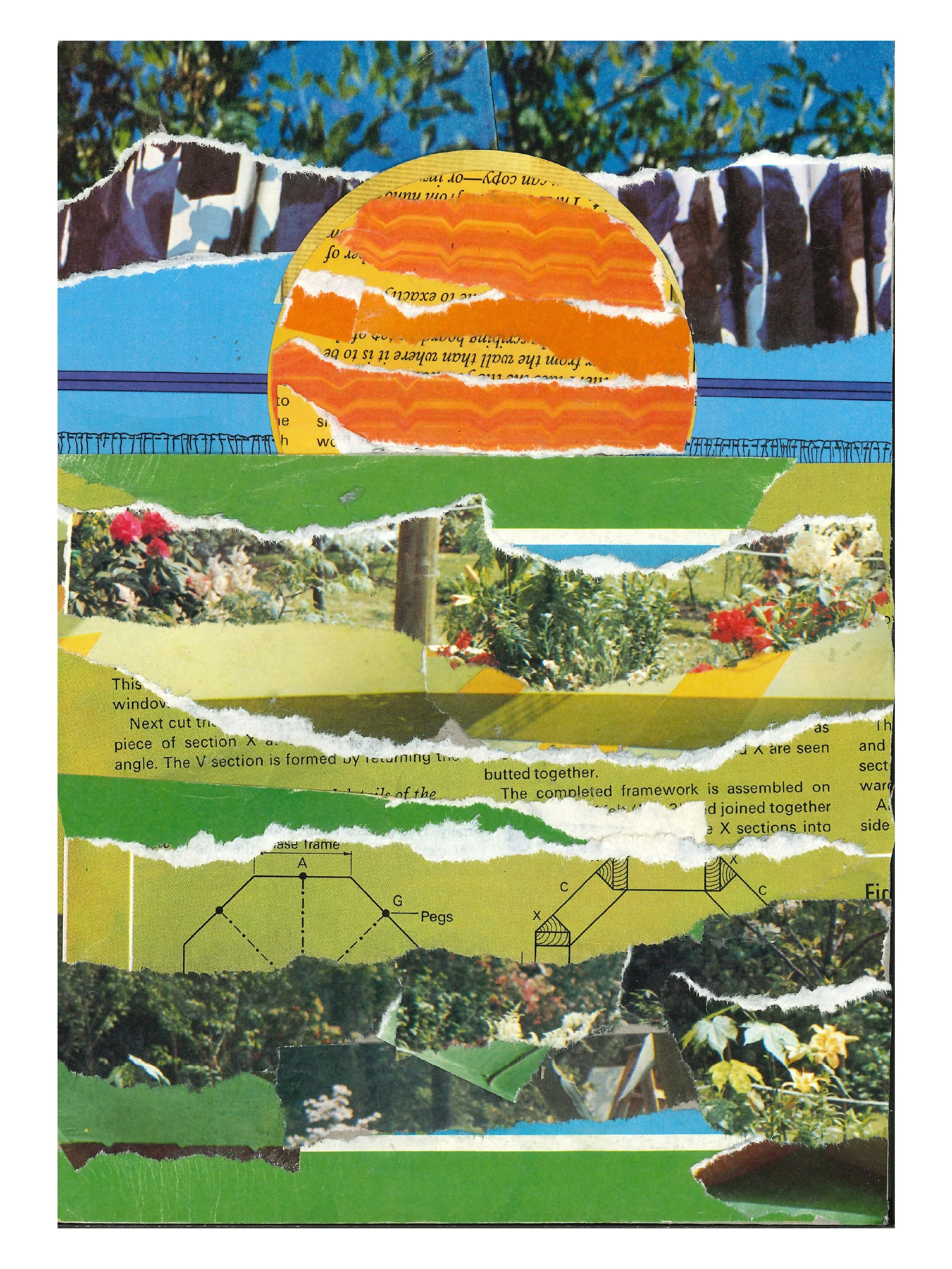
For this challenge, I noticed a lot of bright colours in the magazine, amidst rather drab pages of "how to" photos and dense text. I am attracted to bright or different colours, and the joy of combing through vintage magazines is that you often encounter striking colours that you might not find in contemporary magazines. For the piece "Things To Do in a Day" I loved how the blue played off the yellows, with a dash of red thrown in to make the eyes constantly jump from corner to corner.
But it wasn't just about colour that motivated me. In home design magazines, the pages are filled with pictures of orderly and well-put-together rooms. I wanted to scramble that and give the viewer only shards of the orderly spaces from the magazine. I hope it's disorienting in the best way--like many of the best collages.
I enjoyed the challenge very much. I especially enjoyed receiving a British magazine that I had never encountered before. I'll for sure be using many of those images in future collages (in fact, I already have). I also will for sure do more of these challenges (in fact, I am about to do another one from another magazine I ordered).”
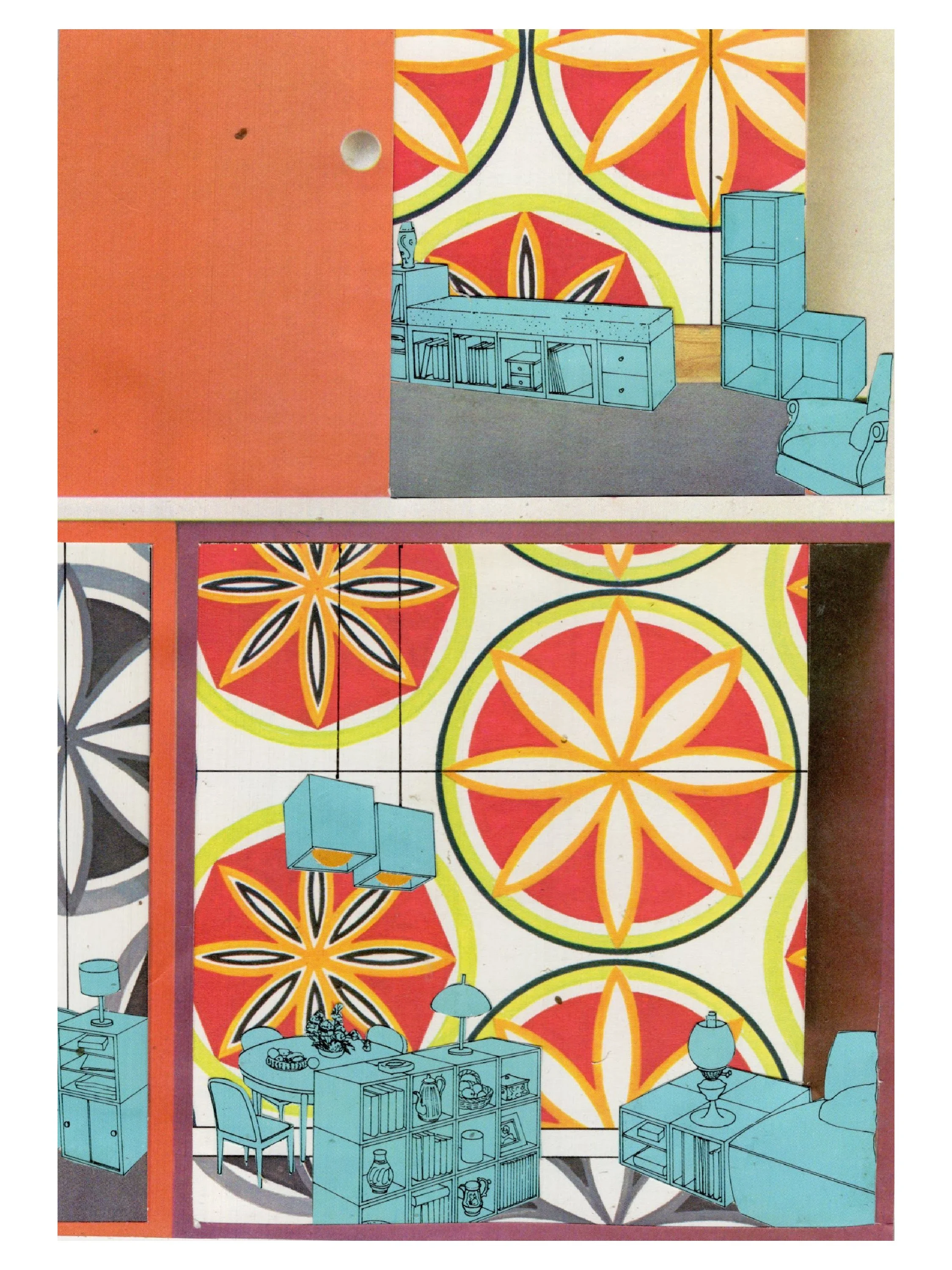
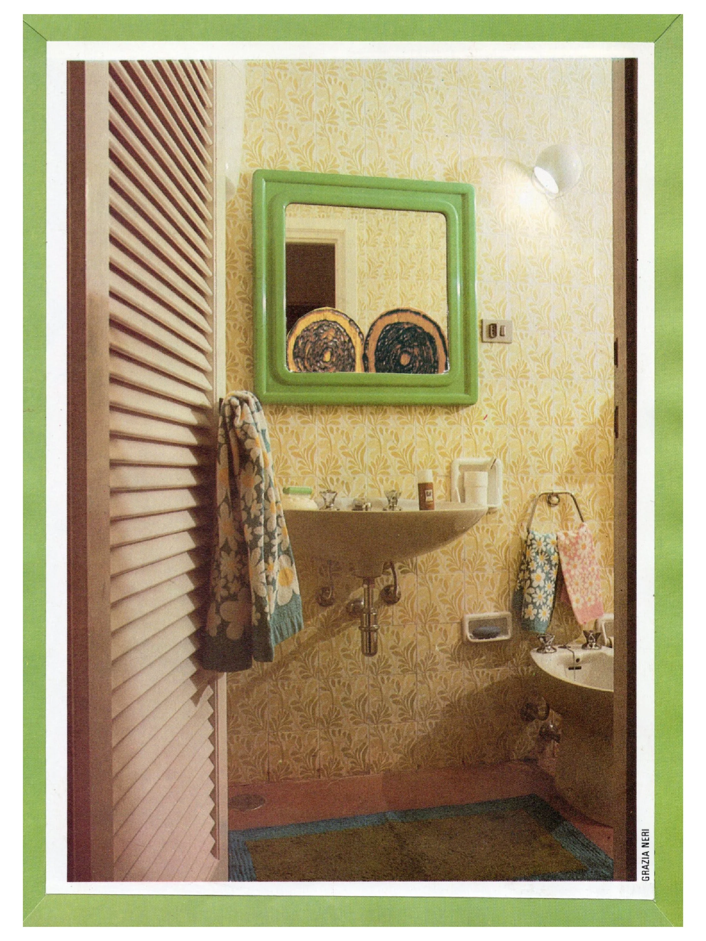
Collages by Carlijn • @carrieverknipt

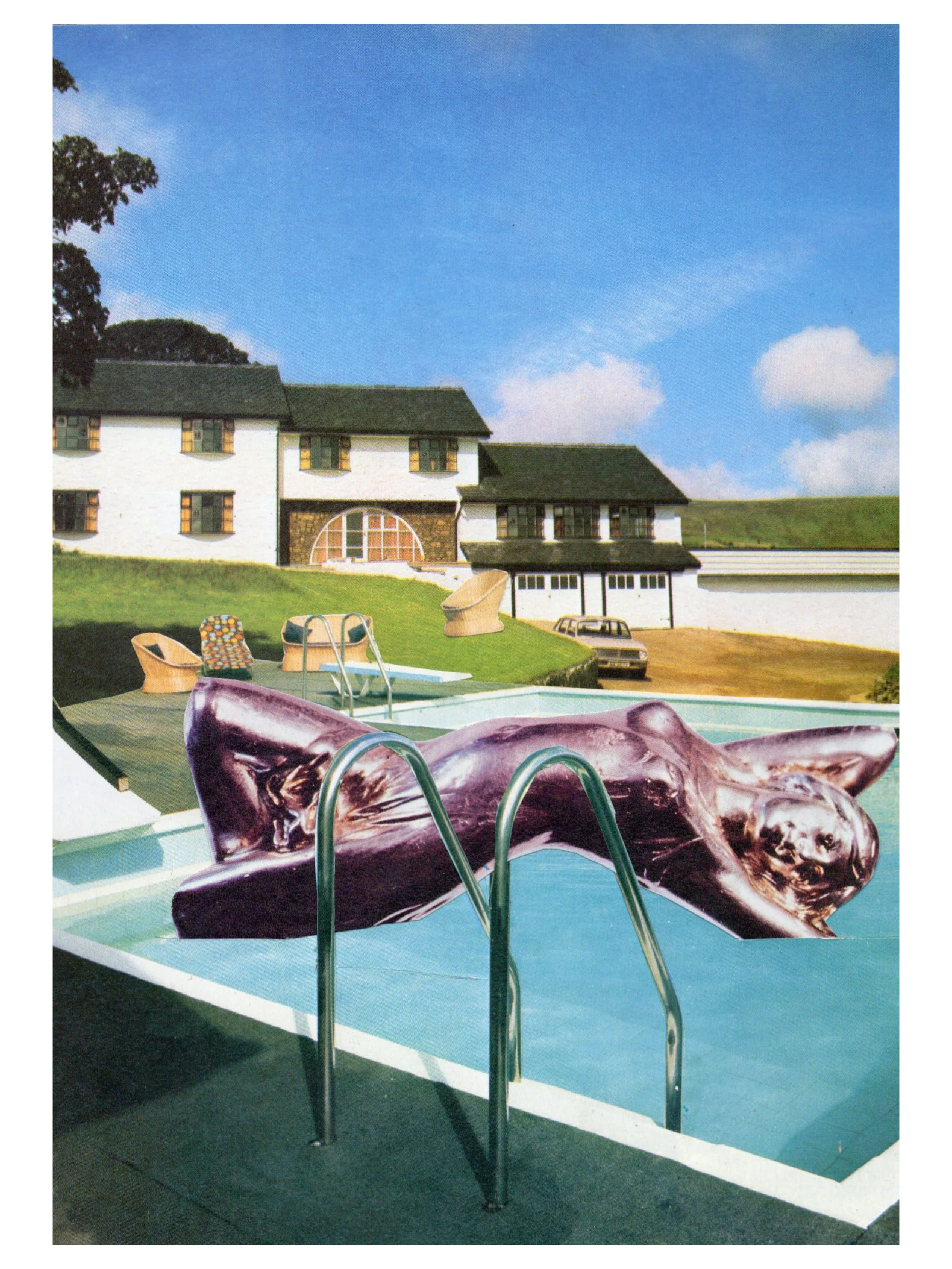
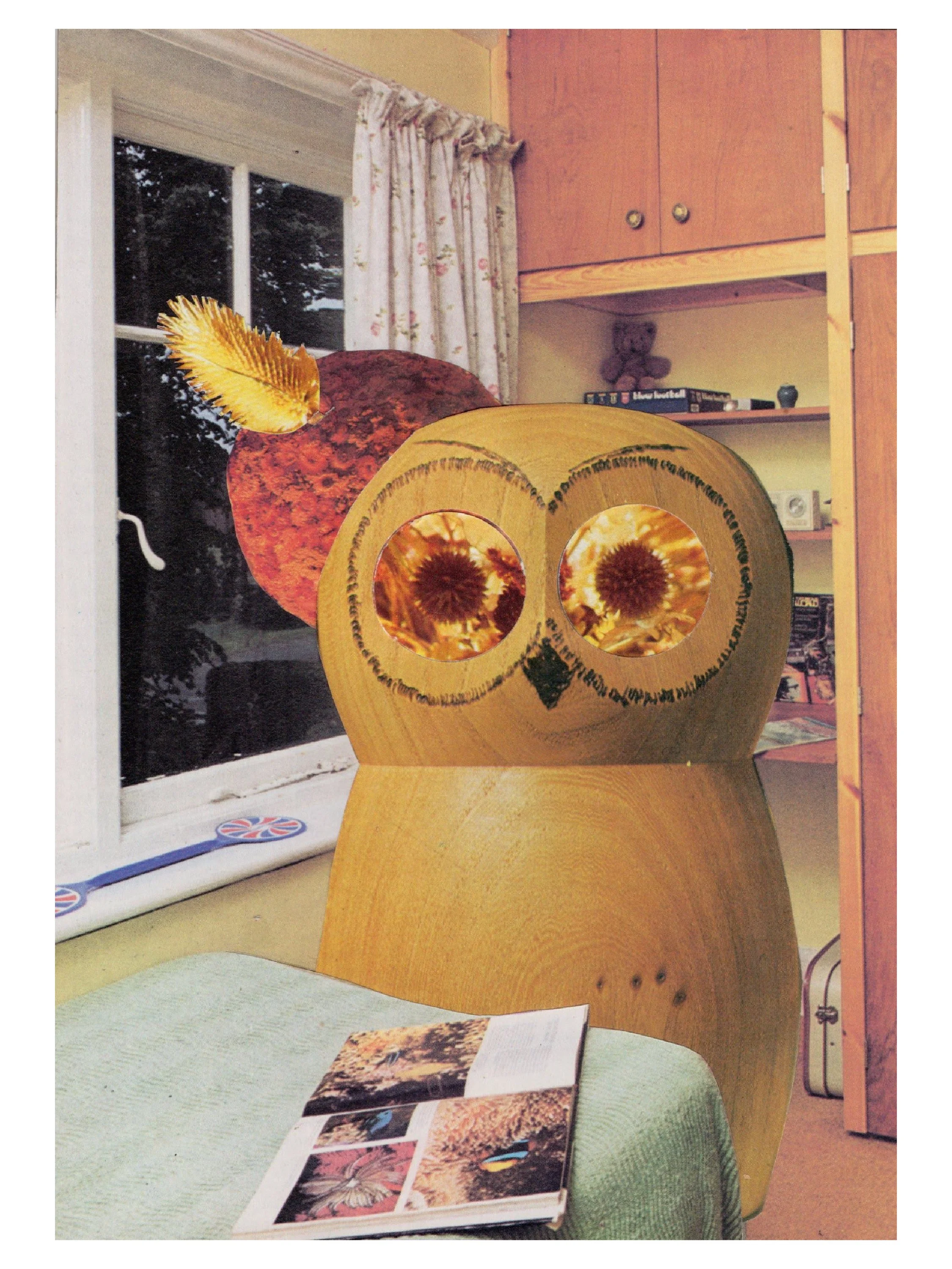
Collages by James Armitage • @nostalgia_cut_and_paste
“I found the challenge totally exhilarating due to the complete randomness of the magazine and the set briefs I chose. The imagery and contrast of colours gave me an added layer of uncharted territory for me.
I'm not used to working this small but it focused the challenge. The approach was one of obviousness [which I regret]. I went full steam ahead with a 'college that represents the theme of the magazine' but used the best imagery in one collage.
By the time I got to the 'typographic collage' I was really struggling with text as I had cut up the majority of the magazines. My thoughts on the final results are a sense of immense achievement, sticking to my goal of producing one a week, it's not really how I work but by putting constraints on this I felt like I had to be more decisive with my layout. I'll definitely take part again.”
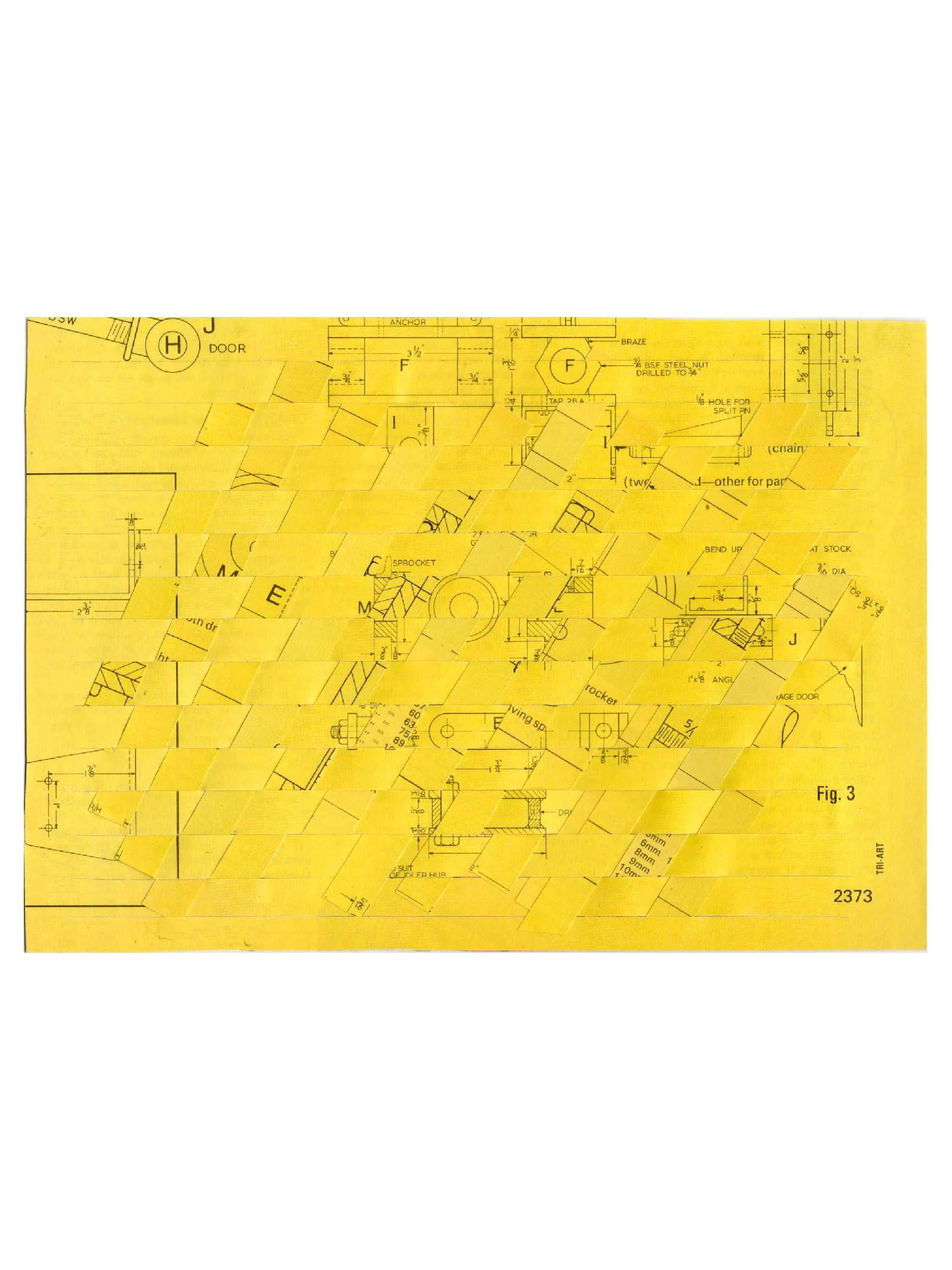
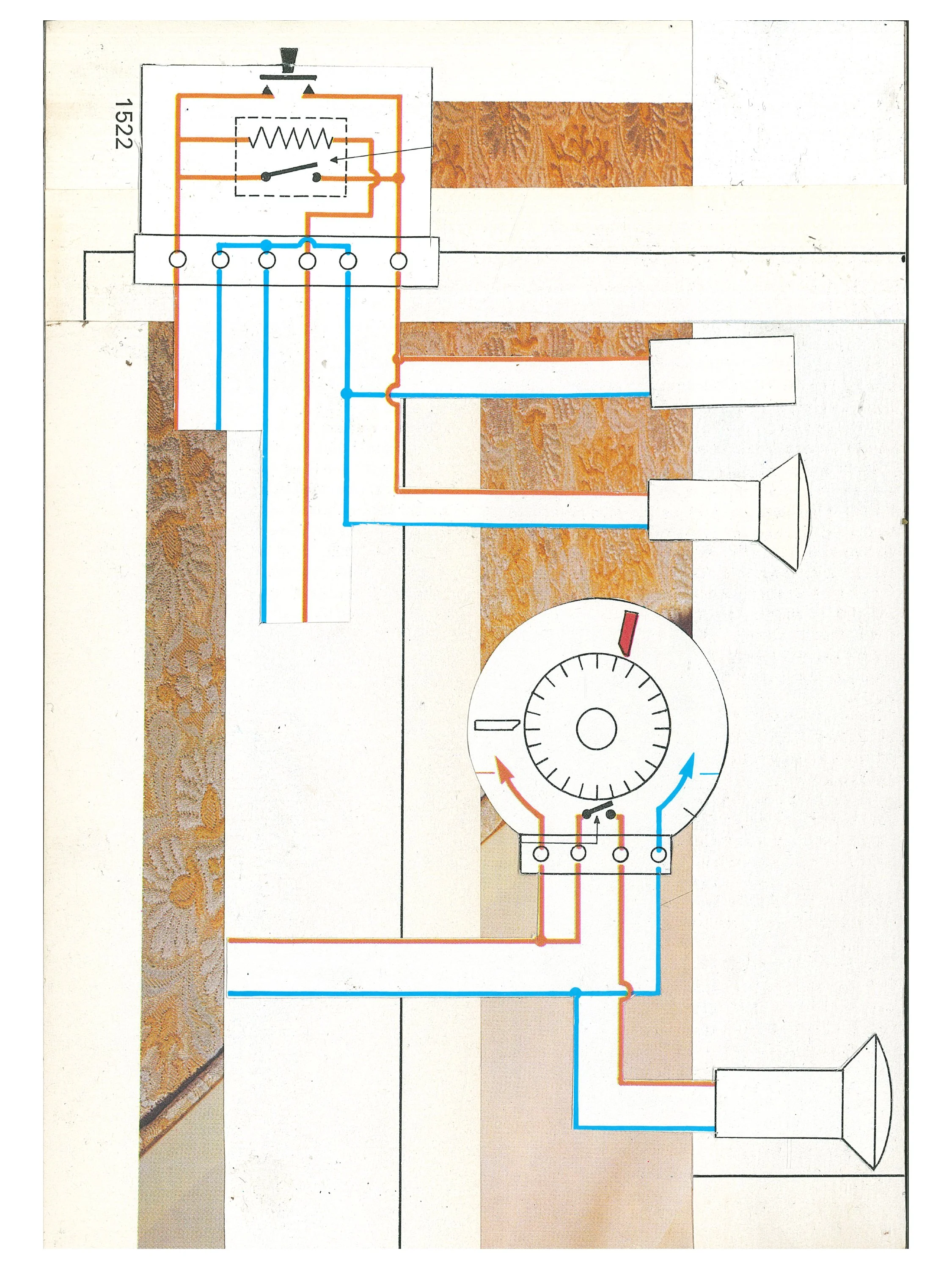
Collages by Eric Ronshaugen • @eronshaugen
“In my approach I had fun changing the narrative of the angular graphic shapes in the magazine to create my images. Turning the plain and simple into more interesting configurations/forms. I ended up enjoying the challenge and like the end results.”
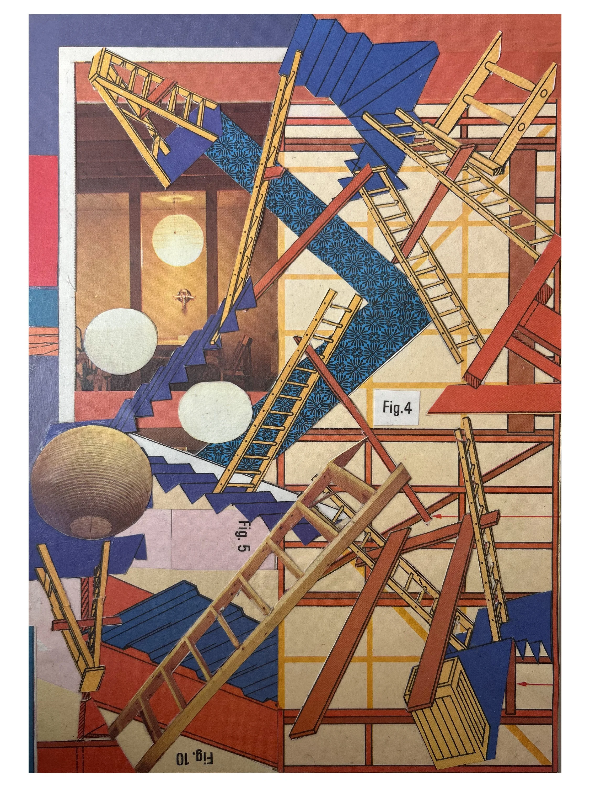

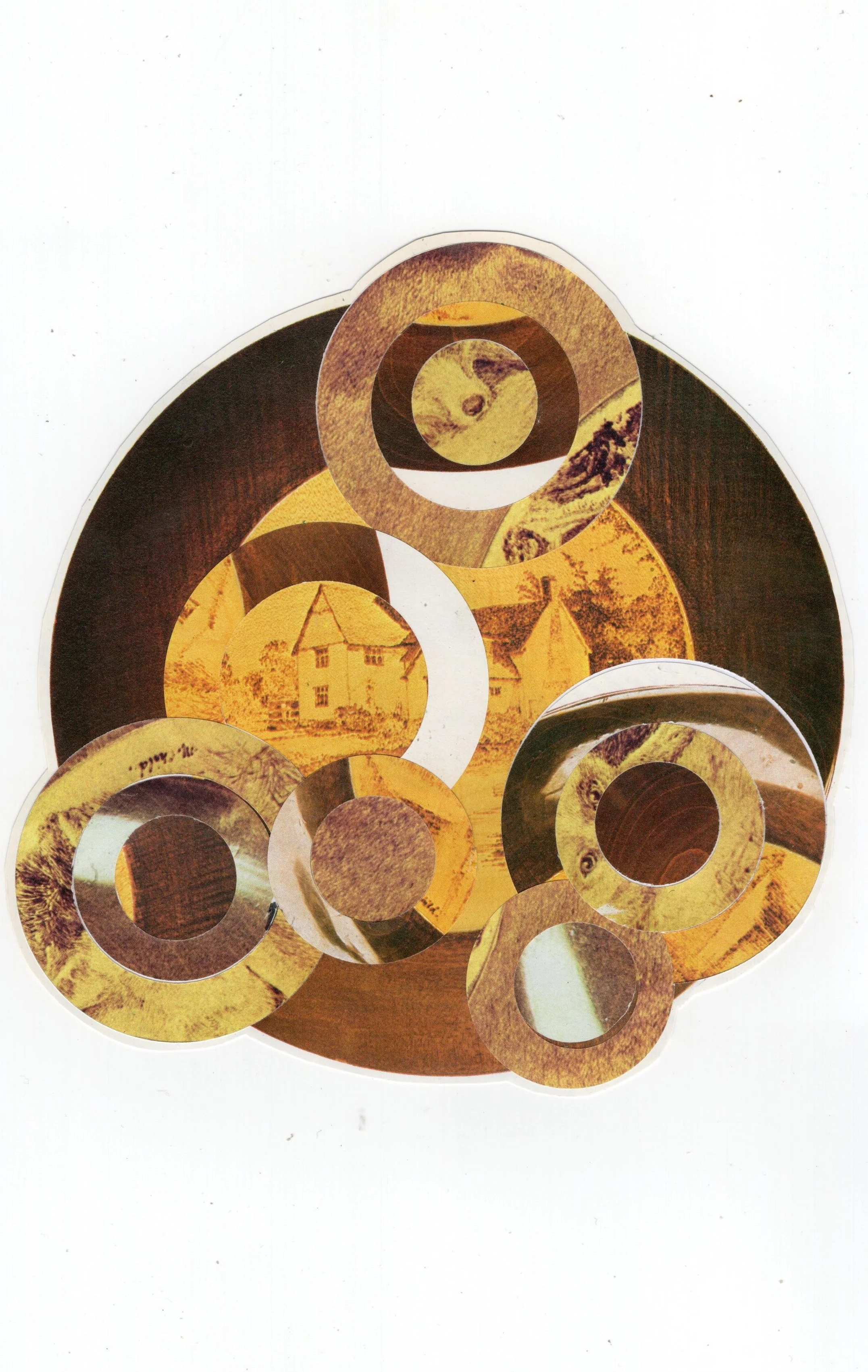
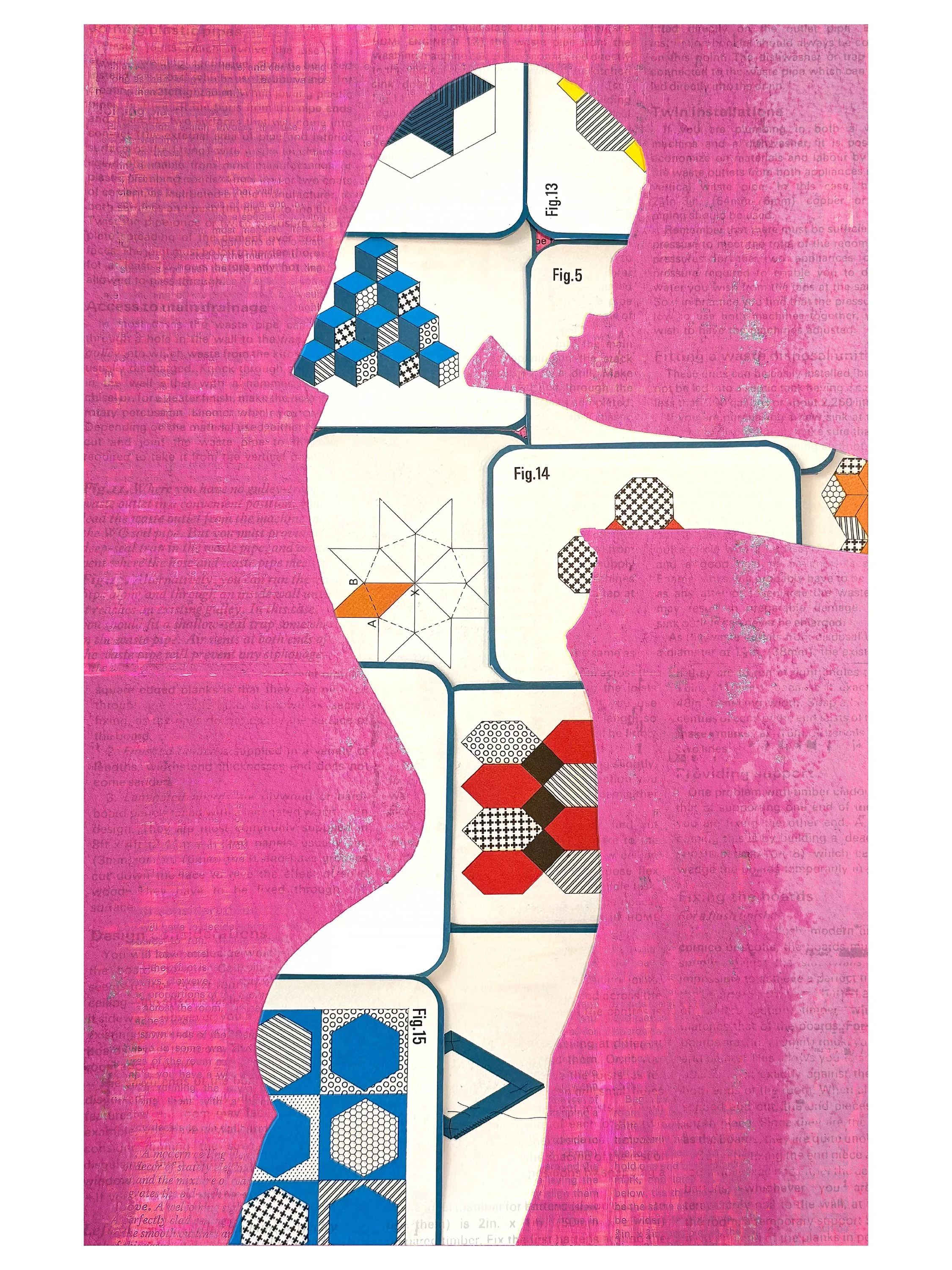
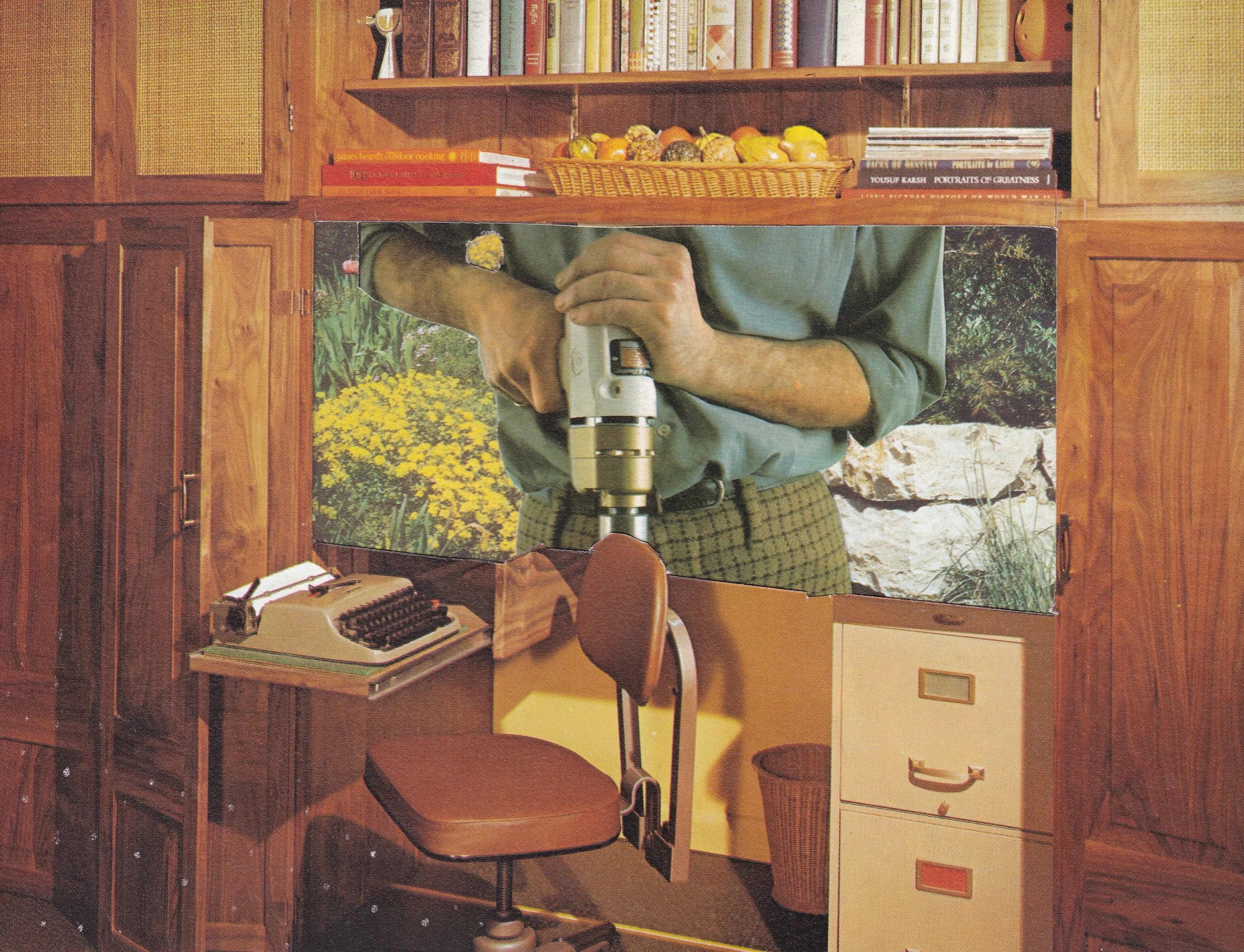
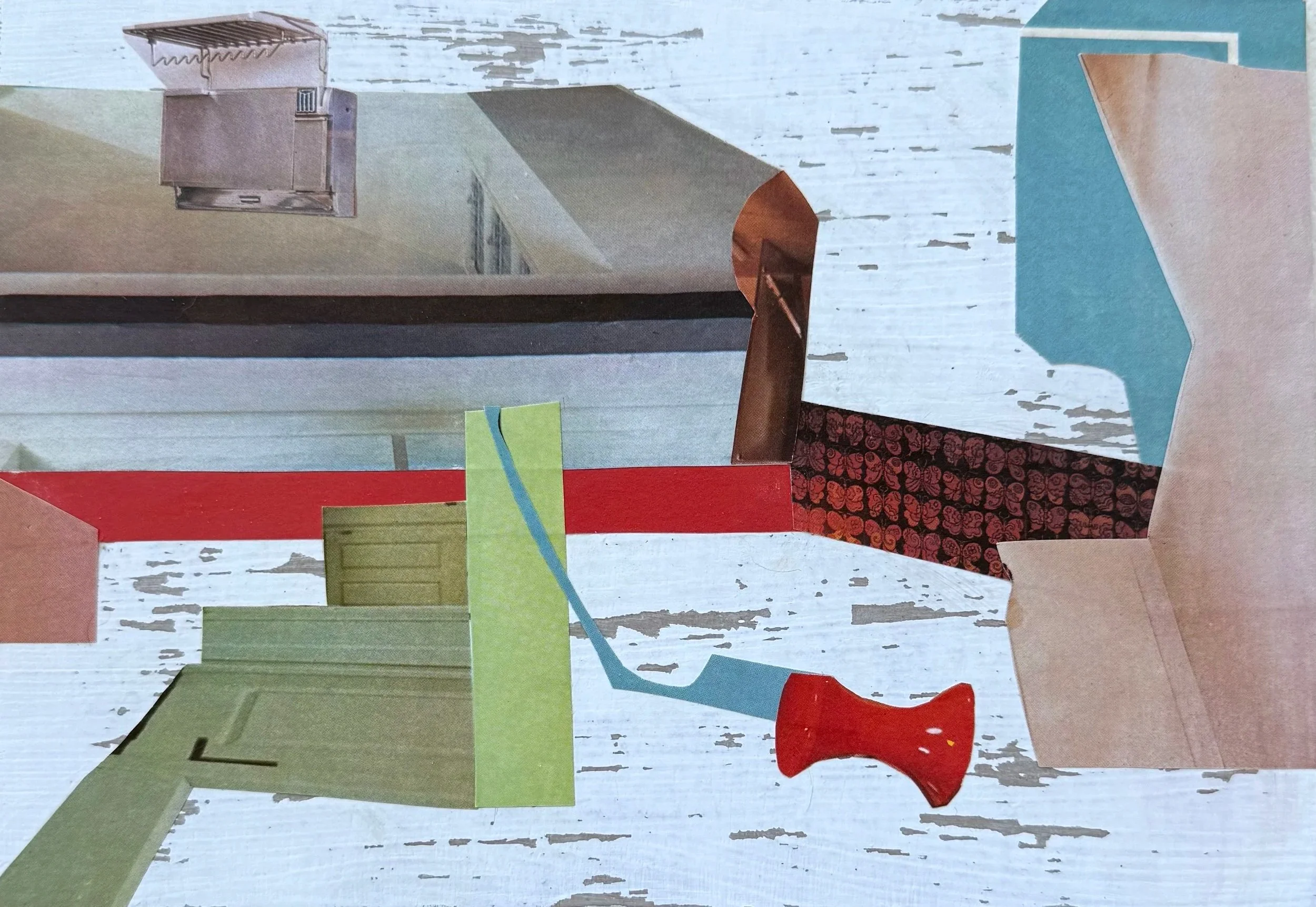
Collages by Zoe Diagne • @diagnezcollage
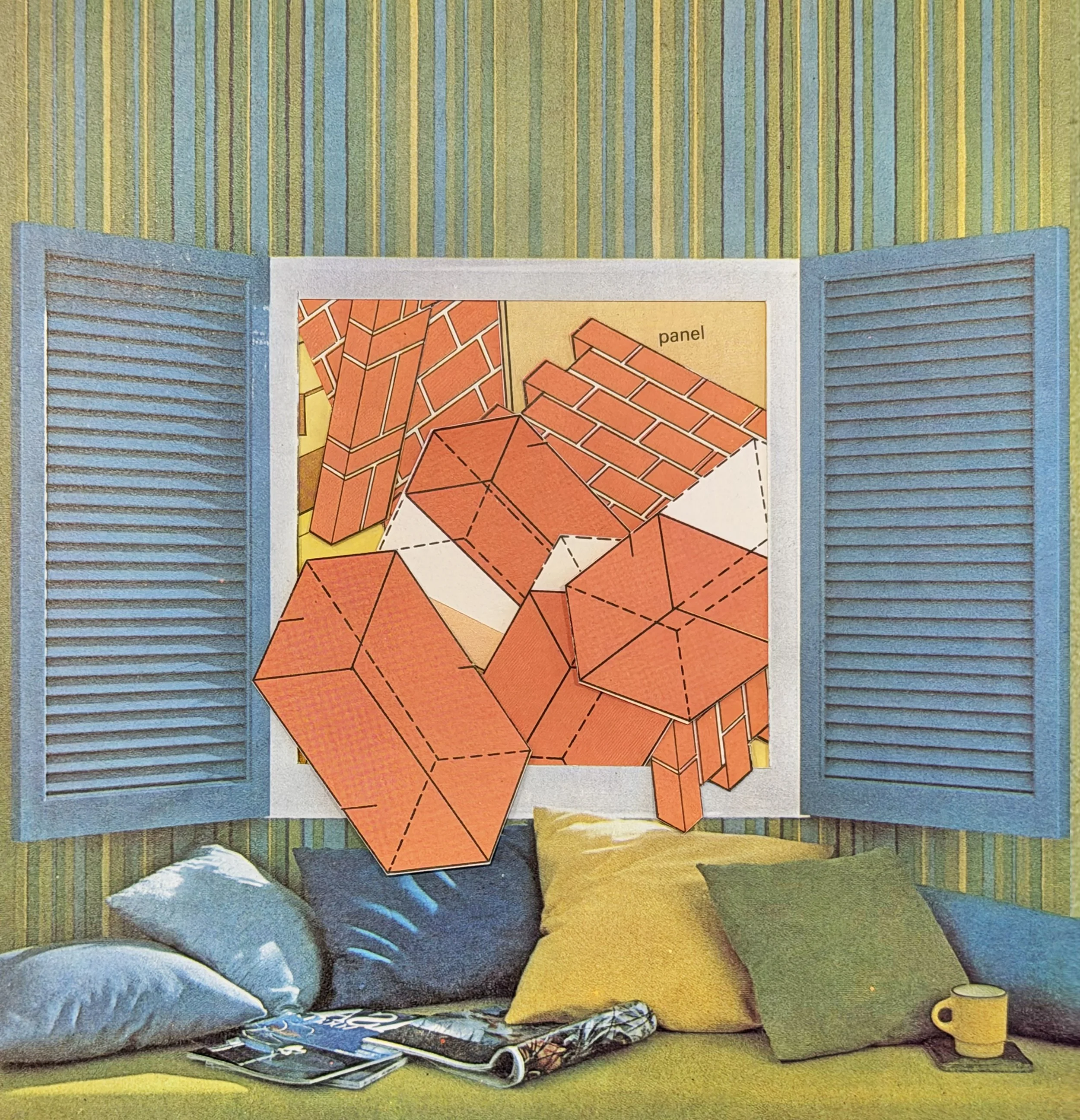
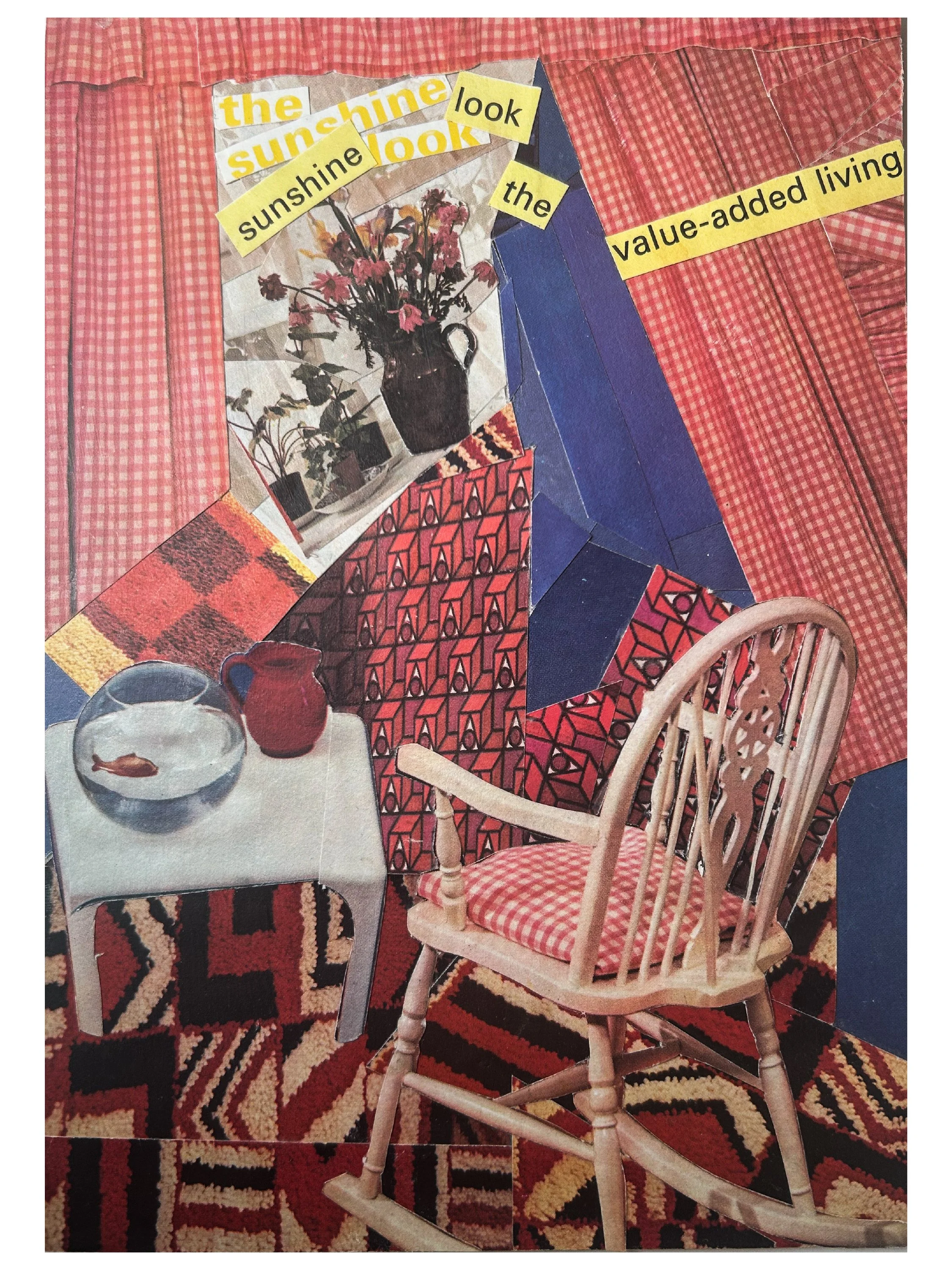
“I have certainly found this one quite a challenge. It made me think about structures and spaces humans create and how those can make you feel in the images. I enjoyed working with the diagrams and instructions cutting them up and subverting their meaning from order and precision to a vertiginous chaos or an abstract wander of lines.
The piece with all the ladders really makes me quite anxious to look at it where as home number 29 gives me warm comforted feelings as it looks very like my grandmothers house. The piece called ‘Value Added Living’ is for me quite an angry response of frustration to living daily with chronic fatigue. It is a charming comfortable interior being thrown off balance where the planes are shifting and the sunshine through the window becomes a lifeline. The title begs the question what does give actual value to our lives? Everyone would have their own response to that, mine would be creativity, art, thinking and making.”

Collages by mau.kolaz • @mau.kolaz
“Normally I tend to use a great variety of materials, combining vintage and modern aesthetics, often using combinations that are antithetical to each other. The same applies to paper textures. I have a tendency to be maximalist and overuse layering.
The limitations in this challenge were quite enjoyable for me as it gave me a boost of creativity, also I found the list of prompts interesting as I had to apply a range of techniques out of my comfort zone.”

Collages by Carol SK • @mydniteblu
“I had an absolute blast with the Vintage Magazine Collage Challenge! My first step was to look through the magazines for themes of colour, texture, and imagery. The next step was playing “mix and match” with the briefs.
Having limited material to work with added a dimension to the collage creation process. It forced you to make choices and also to discover imaginative ways to develop your final images. I would recommend this challenge to everyone, because it really made you have to think outside the box!”
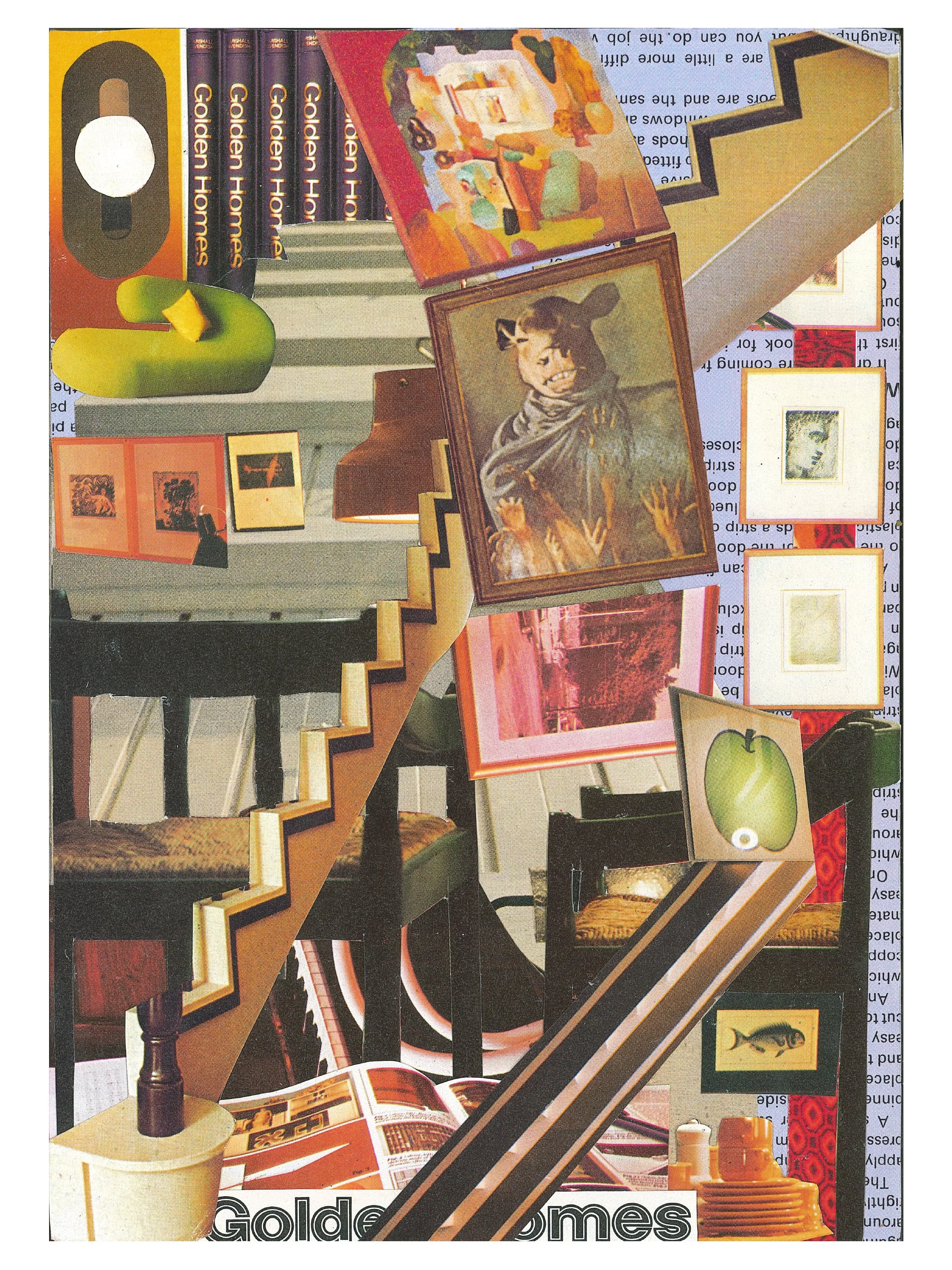
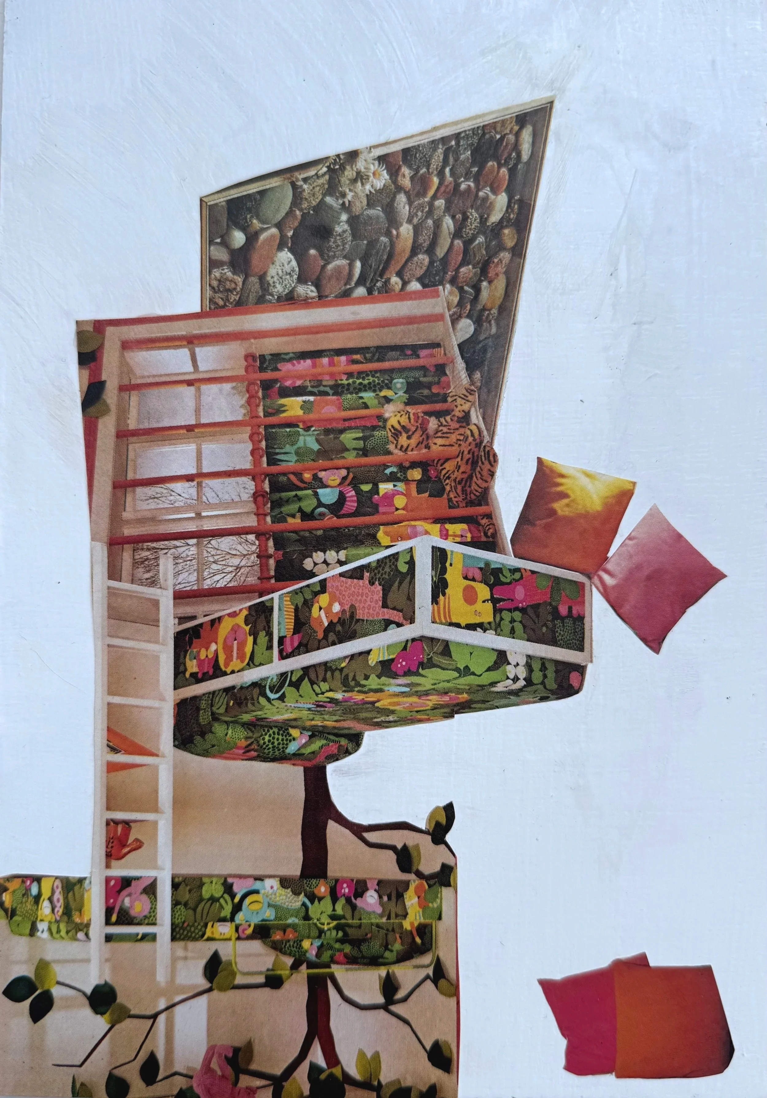
Collages by Adriana
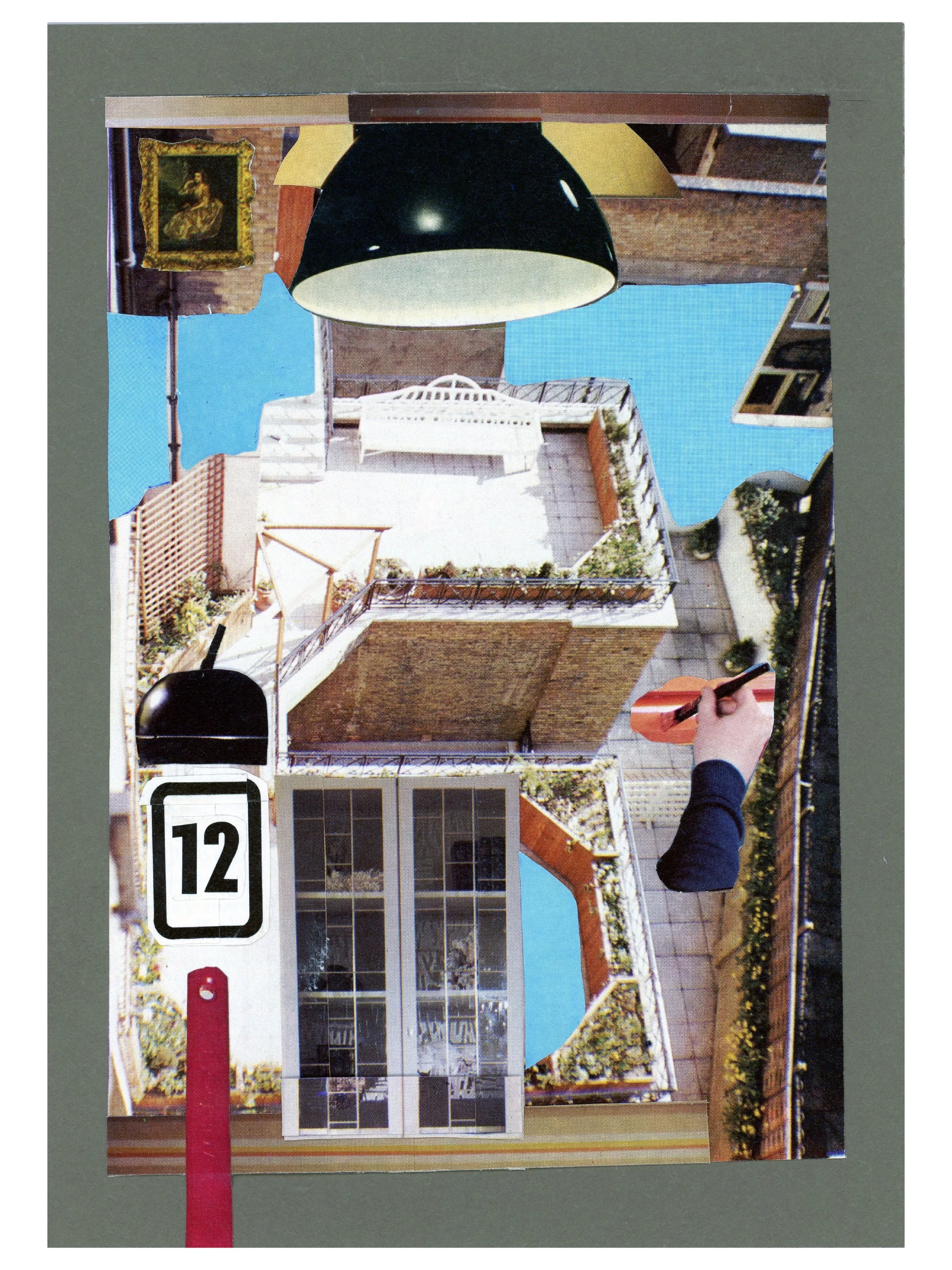
“I was surprised by the magazines. I didn't expect them to be as old and yellowed, basically lacking the gloss and colour of modern magazines. Initially I thought it was going to be difficult to 'modernise' these images and infuse 'colour'. I was happy the directions said I could add a flat colour and was thankful I had received the colour challenge papers with the order, as I used them for the border in 2 of the pieces and the background for the paint can piece. Overall, the more familiar I became with the pages, the more I feel I could have exceeded the 4 substrates included, but not the 8 (double-sided :).
I used a very simple iPad program to experiment with design ideas first, then, if I was still unsure of execution or result, I would make colour copies of the images and try to recreate what I designed on the iPad. Another tool I used, because of having to adhere to the provided substrate, was a piece of transparency plastic that I cut to the size of the substrate to ensure that what I was designing fit the size parameters. Lastly, my goal, overall, was to use a different collage technique for each of the 4 images.
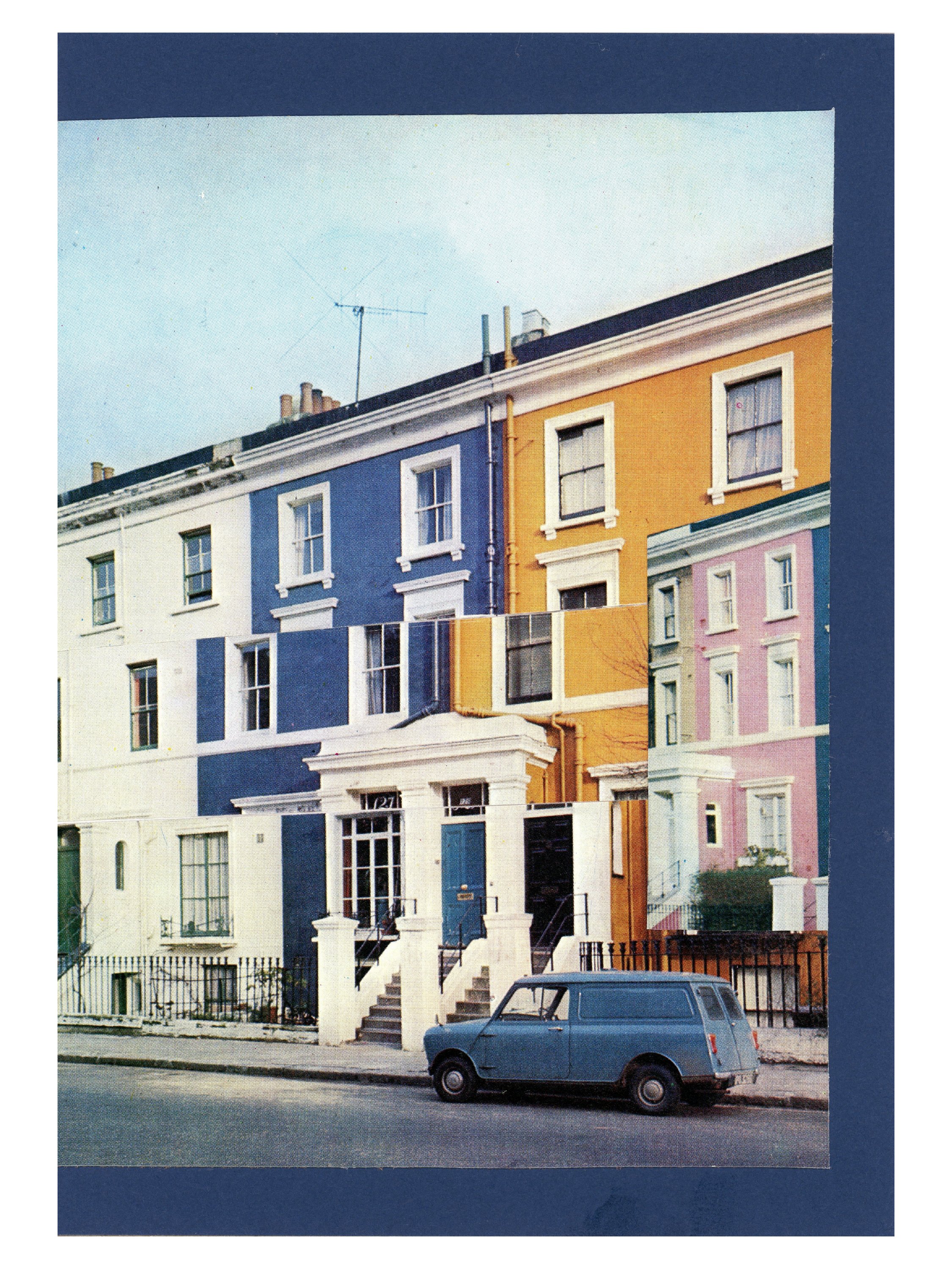
I'm pretty satisfied with the results, they were completed in the A,B,C,D order the images are displayed. Everything in #A, my rooftop terrace Escher-esque creation, is from the magazine, including the blue, but not, as I mentioned before, the green border.
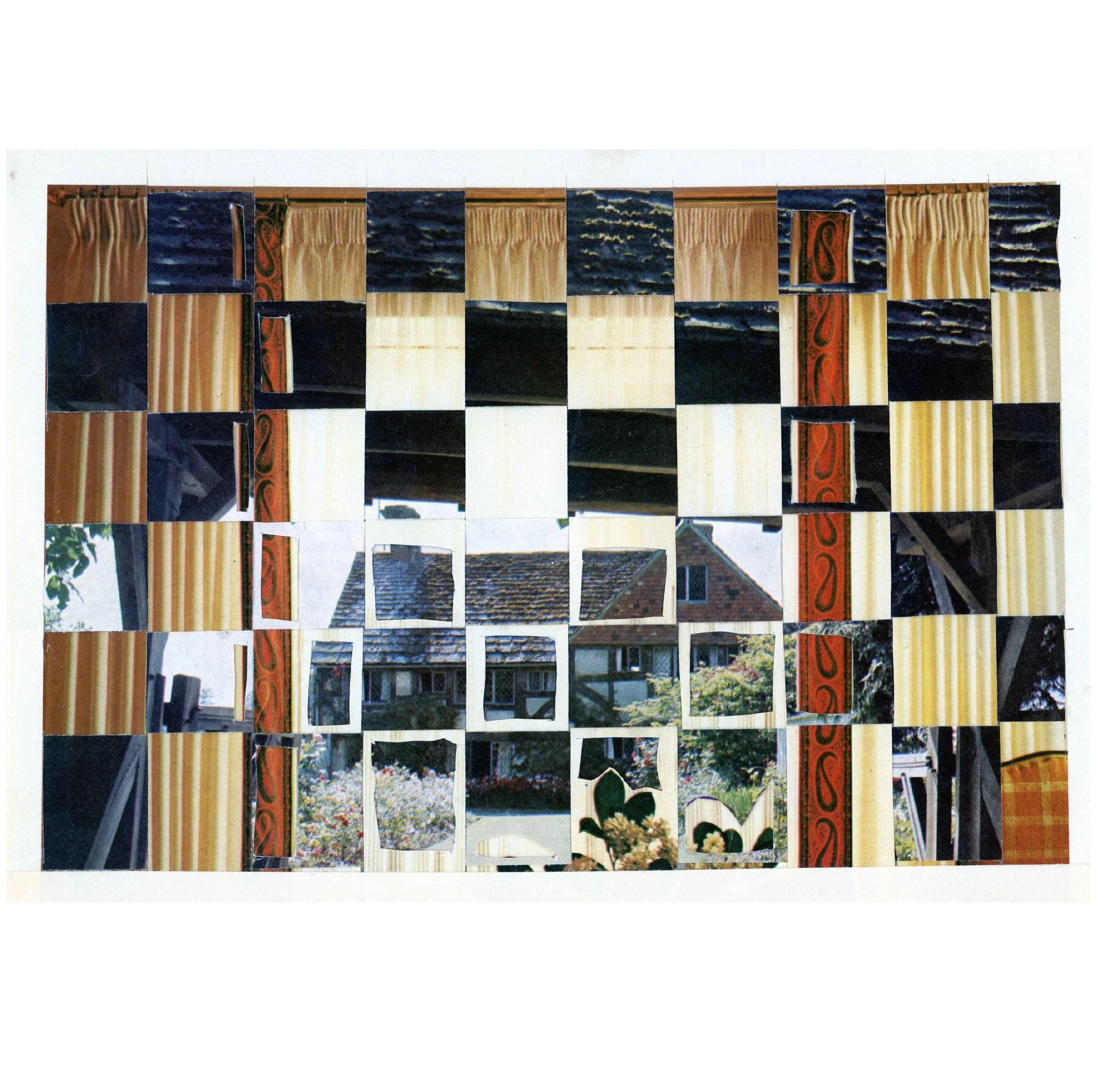
For #B, I did struggle with that one for awhile, and finally settled on the idea that sometimes the more simple things are the better. I've seen various versions of #C out there on the internet, but never have created one myself. This is a case where I wished I could have collaged colour photo copies of the same image as well to create a better version of this style of collage. But, this one, I think works, especially with the car anchoring the image ... and getting ready to drive left, where I purposefully left out the blue border. Lastly, #D, represents, to me, the style and most of the available colours throughout both of the magazines. I paper-wove a view through curtains, utilise cut out windows in it.”

Collages by Steve Morrison • @stevem38155
“The Vintage Magazine Challenge was, in a word, challenging.
Golden Homes has no advertising, no product illustrations, very few photos of people, elements I normally use in my craft. This forced me to work harder and delve deeper into my imagination. I tore out pages, cut out panels, pared panels down to single images, and began the process of mixing it all into something new.
Twice I had to walk away, frustrated that I could not create anything that felt even remotely unique. In the end, I managed to make pieces that are at least whimsical. My favorite is the simplest. I am always amazed at how sometimes in the collage art process things happen by “accident”: the random scrap that just happens to be found, the flipside of a cut magazine piece that fits better than the original, the sudden insight, the rare moment when the light bulb burns bright.
I can’t say that I have anything to do with it, other than being open and aware of the process, open to new directions, or perhaps just being open. Finding my artistic Zen and something cool in the chaos. That’s just a tiny part of the huge, wonderous magic of collage.”


Collages by Jared Sheldon • @j4r3d_5h3ld0n
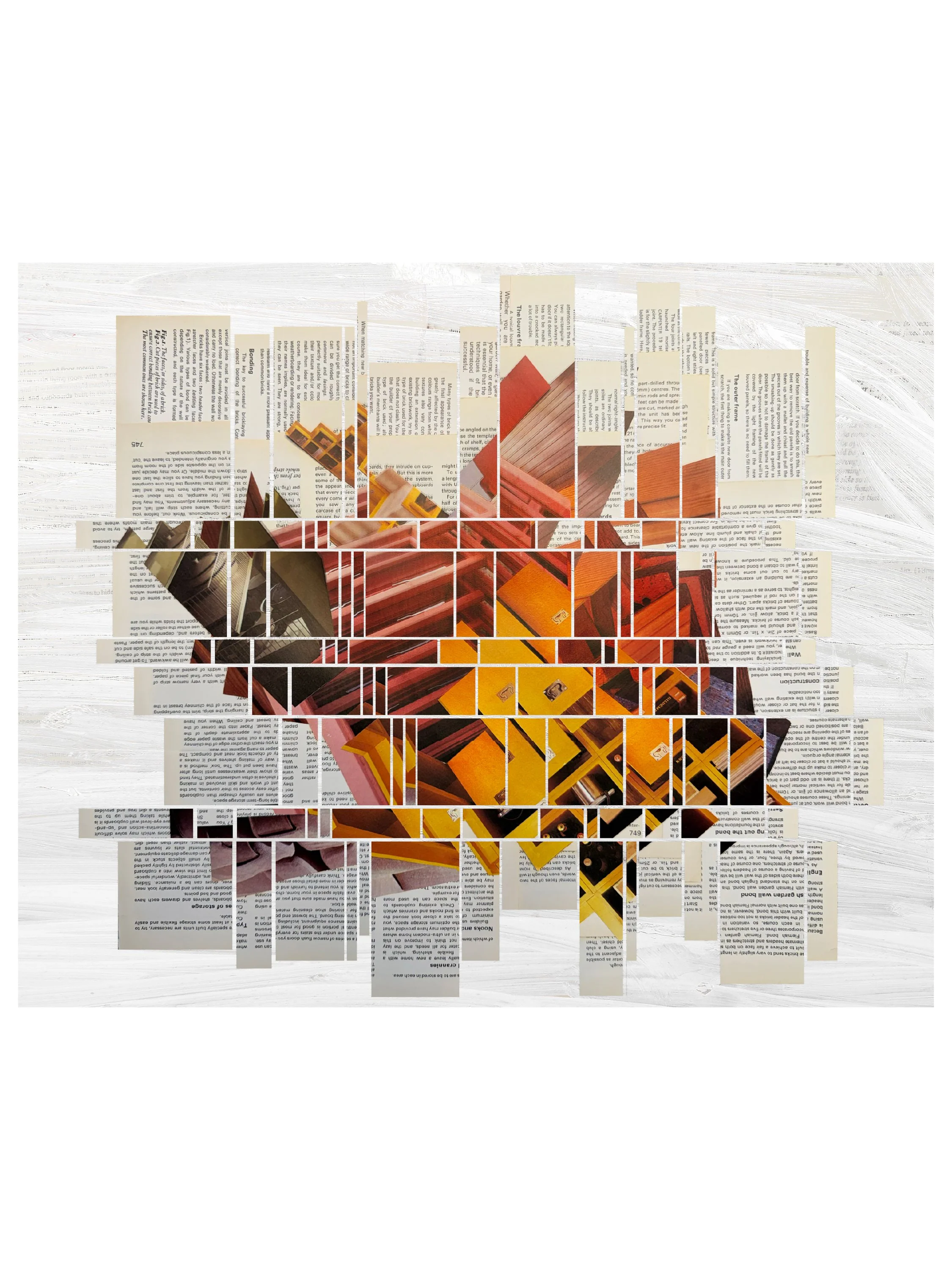
“Chance plays a large role in my art practice. The Vintage Magazine Challenge was an opportunity to create work with material I may not have chosen which provided the chance element I was looking for. I received two issues of Golden Homes, A Marshall Cavendish Encyclopedia in Weekly Parts.
Upon arrival I set about dismantling the magazines, separating the premium images, and storing them in clusters of interest. My collage practice often entails staging elements through several iterations, until a combination clicks. One of the four works had an additional element of chance.
When images being stored in a physical folder settled into a particularly interesting form I pivoted from my original idea and worked with the form that was present. I found the challenge quite motivating. I was able to complete four pieces and there was enough material left to use for several other pieces that didn’t fit on the provided substrate.”